input elementtype 属性的状态type=hidden)type=text) state and Search state (type=search)type=tel)type=url)type=email)type=password)type=date)type=month)type=week)type=time)type=datetime-local)type=number)type=range)type=color)type=checkbox)type=radio)type=file)type=submit)type=image)type=reset)type=button)input 元素属性input element APIsinput elementSupport in all current engines.
Support in all current engines.
type attribute is not in the Hidden state: Interactive content.type attribute is not in the Hidden state: Listed, labelable, submittable, resettable, and autocapitalize-inheriting form-associated element.type attribute is in the Hidden state: Listed, submittable, resettable, and autocapitalize-inheriting form-associated element.type attribute is not in the Hidden state: Palpable content.accept — Hint for expected file type in file upload controlsalt — Replacement text for use when images are not availableautocomplete — Hint for form autofill featurechecked — Whether the control is checkeddirname — Name of form control to use for sending the element's directionality in form submissiondisabled — Whether the form control is disabledform — Associates the element with a form elementformaction — URL to use for form submissionformenctype — Entry list encoding type to use for form submissionformmethod — Variant to use for form submissionformnovalidate — Bypass form control validation for form submissionformtarget — Browsing context for form submissionheight — Vertical dimensionlist — List of autocomplete optionsmax — Maximum valuemaxlength — Maximum length of valuemin — Minimum valueminlength — Minimum length of valuemultiple — Whether to allow multiple valuesname — Name of the element to use for form submission and in the form.elements API pattern — Pattern to be matched by the form control's valueplaceholder — User-visible label to be placed within the form controlreadonly — Whether to allow the value to be edited by the userrequired — Whether the control is required for form submissionsize — Size of the controlsrc — Address of the resourcestep — Granularity to be matched by the form control's valuetype — Type of form controlvalue — Value of the form controlwidth — Horizontal dimensiontitle attribute has special semantics on this element: Description of pattern (when used with pattern attribute).type attribute in the Hidden state: for authors; for implementers.type attribute in the Text state: for authors; for implementers.type attribute in the Search state: for authors; for implementers.type attribute in the Telephone state: for authors; for implementers.type attribute in the URL state: for authors; for implementers.type attribute in the Email state: for authors; for implementers.type attribute in the Password state: for authors; for implementers.type attribute in the Date state: for authors; for implementers.type attribute in the Month state: for authors; for implementers.type attribute in the Week state: for authors; for implementers.type attribute in the Time state: for authors; for implementers.type attribute in the Local Date and Time state: for authors; for implementers.type attribute in the Number state: for authors; for implementers.type attribute in the Range state: for authors; for implementers.type attribute in the Color state: for authors; for implementers.type attribute in the Checkbox state: for authors; for implementers.type attribute in the Radio Button state: for authors; for implementers.type attribute in the File Upload state: for authors; for implementers.type attribute in the Submit Button state: for authors; for implementers.type attribute in the Image Button state: for authors; for implementers.type attribute in the Reset Button state: for authors; for implementers.type attribute in the Button state: for authors; for implementers.[Exposed=Window]
interface HTMLInputElement : HTMLElement {
[HTMLConstructor] constructor();
[CEReactions] attribute DOMString accept;
[CEReactions] attribute DOMString alt;
[CEReactions] attribute DOMString autocomplete;
[CEReactions] attribute boolean defaultChecked;
attribute boolean checked;
[CEReactions] attribute DOMString dirName;
[CEReactions] attribute boolean disabled;
readonly attribute HTMLFormElement? form;
attribute FileList? files;
[CEReactions] attribute USVString formAction;
[CEReactions] attribute DOMString formEnctype;
[CEReactions] attribute DOMString formMethod;
[CEReactions] attribute boolean formNoValidate;
[CEReactions] attribute DOMString formTarget;
[CEReactions] attribute unsigned long height;
attribute boolean indeterminate;
readonly attribute HTMLElement? list;
[CEReactions] attribute DOMString max;
[CEReactions] attribute long maxLength;
[CEReactions] attribute DOMString min;
[CEReactions] attribute long minLength;
[CEReactions] attribute boolean multiple;
[CEReactions] attribute DOMString name;
[CEReactions] attribute DOMString pattern;
[CEReactions] attribute DOMString placeholder;
[CEReactions] attribute boolean readOnly;
[CEReactions] attribute boolean required;
[CEReactions] attribute unsigned long size;
[CEReactions] attribute USVString src;
[CEReactions] attribute DOMString step;
[CEReactions] attribute DOMString type;
[CEReactions] attribute DOMString defaultValue;
[CEReactions] attribute [LegacyNullToEmptyString] DOMString value;
attribute object? valueAsDate;
attribute unrestricted double valueAsNumber;
[CEReactions] attribute unsigned long width;
undefined stepUp(optional long n = 1);
undefined stepDown(optional long n = 1);
readonly attribute boolean willValidate;
readonly attribute ValidityState validity;
readonly attribute DOMString validationMessage;
boolean checkValidity();
boolean reportValidity();
undefined setCustomValidity(DOMString error);
readonly attribute NodeList? labels;
undefined select();
attribute unsigned long? selectionStart;
attribute unsigned long? selectionEnd;
attribute DOMString? selectionDirection;
undefined setRangeText(DOMString replacement);
undefined setRangeText(DOMString replacement, unsigned long start, unsigned long end, optional SelectionMode selectionMode = "preserve");
undefined setSelectionRange(unsigned long start, unsigned long end, optional DOMString direction);
// also has obsolete members
};The input element represents a typed data field, usually with a form
control to allow the user to edit the data.
The type attribute
controls the data type (and associated control) of the element. It is an enumerated
attribute. The following table lists the keywords and states for the attribute — the
keywords in the left column map to the states in the cell in the second column on the same row as
the keyword.
| Keyword | State | Data type | Control type |
|---|---|---|---|
hidden
| An arbitrary string | n/a | |
text
| Text | Text with no line breaks | A text control |
search
| Search | Text with no line breaks | Search control |
tel
| Telephone | Text with no line breaks | A text control |
url
| URL | An absolute URL | A text control |
email
| An email address or list of email addresses | A text control | |
password
| Password | Text with no line breaks (sensitive information) | A text control that obscures data entry |
date
| Date | A date (year, month, day) with no time zone | A date control |
month
| Month | A date consisting of a year and a month with no time zone | A month control |
week
| Week | A date consisting of a week-year number and a week number with no time zone | A week control |
time
| Time | A time (hour, minute, seconds, fractional seconds) with no time zone | A time control |
datetime-local
| Local Date and Time | A date and time (year, month, day, hour, minute, second, fraction of a second) with no time zone | A date and time control |
number
| Number | A numerical value | A text control or spinner control |
range
| Range | A numerical value, with the extra semantic that the exact value is not important | A slider control or similar |
color
| Color | An sRGB color with 8-bit red, green, and blue components | A color picker |
checkbox
| Checkbox | A set of zero or more values from a predefined list | A checkbox |
radio
| Radio Button | An enumerated value | A radio button |
file
| File Upload | Zero or more files each with a MIME type and optionally a file name | A label and a button |
submit
| Submit Button | An enumerated value, with the extra semantic that it must be the last value selected and initiates form submission | A button |
image
| Image Button | A coordinate, relative to a particular image's size, with the extra semantic that it must be the last value selected and initiates form submission | Either a clickable image, or a button |
reset
| Reset Button | n/a | A button |
button
| Button | n/a | A button |
The missing value default and the invalid value default are the Text state.
Which of the
accept,
alt,
autocomplete,
checked,
dirname,
formaction,
formenctype,
formmethod,
formnovalidate,
formtarget,
height,
list,
max,
maxlength,
min,
minlength,
multiple,
pattern,
placeholder,
readonly,
required,
size,
src,
step, and
width content attributes, the
checked,
files,
valueAsDate,
valueAsNumber, and
list IDL attributes, the
select() method, the
selectionStart,
selectionEnd, and
selectionDirection, IDL attributes, the
setRangeText() and
setSelectionRange() methods, the
stepUp() and
stepDown() methods, and the
input and
change events apply to an
input element depends on the state of its
type attribute.
The subsections that define each type also clearly define in normative "bookkeeping" sections
which of these feature apply, and which do not apply, to each type. The behavior of
these features depends on whether they apply or not, as defined in their various sections (q.v.
for content attributes, for APIs, for events).
The following table is non-normative and summarizes which of those content attributes, IDL attributes, methods, and events apply to each state:
| Text, Search | URL, Telephone | Password | Date, Month, Week, Time | Local Date and Time | Number | Range | Color | Checkbox, Radio Button | File Upload | Submit Button | Image Button | Reset Button, Button | |||
|---|---|---|---|---|---|---|---|---|---|---|---|---|---|---|---|
| Content attributes | |||||||||||||||
accept
| · | · | · | · | · | · | · | · | · | · | · | Yes | · | · | · |
alt
| · | · | · | · | · | · | · | · | · | · | · | · | · | Yes | · |
autocomplete
| Yes | Yes | Yes | Yes | Yes | Yes | Yes | Yes | Yes | Yes | · | · | · | · | · |
checked
| · | · | · | · | · | · | · | · | · | · | Yes | · | · | · | · |
dirname
| · | Yes | · | · | · | · | · | · | · | · | · | · | · | · | · |
formaction
| · | · | · | · | · | · | · | · | · | · | · | · | Yes | Yes | · |
formenctype
| · | · | · | · | · | · | · | · | · | · | · | · | Yes | Yes | · |
formmethod
| · | · | · | · | · | · | · | · | · | · | · | · | Yes | Yes | · |
formnovalidate
| · | · | · | · | · | · | · | · | · | · | · | · | Yes | Yes | · |
formtarget
| · | · | · | · | · | · | · | · | · | · | · | · | Yes | Yes | · |
height
| · | · | · | · | · | · | · | · | · | · | · | · | · | Yes | · |
list
| · | Yes | Yes | Yes | · | Yes | Yes | Yes | Yes | Yes | · | · | · | · | · |
max
| · | · | · | · | · | Yes | Yes | Yes | Yes | · | · | · | · | · | · |
maxlength
| · | Yes | Yes | Yes | Yes | · | · | · | · | · | · | · | · | · | · |
min
| · | · | · | · | · | Yes | Yes | Yes | Yes | · | · | · | · | · | · |
minlength
| · | Yes | Yes | Yes | Yes | · | · | · | · | · | · | · | · | · | · |
multiple
| · | · | · | Yes | · | · | · | · | · | · | · | Yes | · | · | · |
pattern
| · | Yes | Yes | Yes | Yes | · | · | · | · | · | · | · | · | · | · |
placeholder
| · | Yes | Yes | Yes | Yes | · | · | Yes | · | · | · | · | · | · | · |
readonly
| · | Yes | Yes | Yes | Yes | Yes | Yes | Yes | · | · | · | · | · | · | · |
required
| · | Yes | Yes | Yes | Yes | Yes | Yes | Yes | · | · | Yes | Yes | · | · | · |
size
| · | Yes | Yes | Yes | Yes | · | · | · | · | · | · | · | · | · | · |
src
| · | · | · | · | · | · | · | · | · | · | · | · | · | Yes | · |
step
| · | · | · | · | · | Yes | Yes | Yes | Yes | · | · | · | · | · | · |
width
| · | · | · | · | · | · | · | · | · | · | · | · | · | Yes | · |
| IDL attributes and methods | |||||||||||||||
checked
| · | · | · | · | · | · | · | · | · | · | Yes | · | · | · | · |
files
| · | · | · | · | · | · | · | · | · | · | · | Yes | · | · | · |
value
| default | value | value | value | value | value | value | value | value | value | default/on | filename | default | default | default |
valueAsDate
| · | · | · | · | · | Yes | · | · | · | · | · | · | · | · | · |
valueAsNumber
| · | · | · | · | · | Yes | Yes | Yes | Yes | · | · | · | · | · | · |
list
| · | Yes | Yes | Yes | · | Yes | Yes | Yes | Yes | Yes | · | · | · | · | · |
select()
| · | Yes | Yes | Yes† | Yes | Yes† | Yes† | Yes† | · | Yes† | · | Yes† | · | · | · |
selectionStart
| · | Yes | Yes | · | Yes | · | · | · | · | · | · | · | · | · | · |
selectionEnd
| · | Yes | Yes | · | Yes | · | · | · | · | · | · | · | · | · | · |
selectionDirection
| · | Yes | Yes | · | Yes | · | · | · | · | · | · | · | · | · | · |
setRangeText()
| · | Yes | Yes | · | Yes | · | · | · | · | · | · | · | · | · | · |
setSelectionRange()
| · | Yes | Yes | · | Yes | · | · | · | · | · | · | · | · | · | · |
stepDown()
| · | · | · | · | · | Yes | Yes | Yes | Yes | · | · | · | · | · | · |
stepUp()
| · | · | · | · | · | Yes | Yes | Yes | Yes | · | · | · | · | · | · |
| Events | |||||||||||||||
input event
| · | Yes | Yes | Yes | Yes | Yes | Yes | Yes | Yes | Yes | Yes | Yes | · | · | · |
change event
| · | Yes | Yes | Yes | Yes | Yes | Yes | Yes | Yes | Yes | Yes | Yes | · | · | · |
† If the control has no selectable text, the select() method results in a no-op, with no
"InvalidStateError" DOMException.
Some states of the type attribute define a value
sanitization algorithm.
Each input element has a value, which is
exposed by the value IDL attribute. Some states define an
algorithm to convert a string to a number,
an algorithm to convert a number to a
string, an algorithm to convert a string to a
Date object, and an algorithm to
convert a Date object to a string, which are used by max, min, step, valueAsDate,
valueAsNumber, and stepUp().
An input element's dirty value flag must be
set to true whenever the user interacts with the control in a way that changes the value. (It is also set to true when the value is programmatically
changed, as described in the definition of the value IDL
attribute.)
The value content
attribute gives the default value of the input
element. When the value content attribute is
added, set, or removed, if the control's dirty value flag
is false, the user agent must set the value of the element
to the value of the value content attribute, if there is
one, or the empty string otherwise, and then run the current value sanitization
algorithm, if one is defined.
Each input element has a checkedness,
which is exposed by the checked IDL attribute.
Each input element has a boolean dirty checkedness flag. When it is true, the
element is said to have a dirty checkedness.
The dirty checkedness flag must be initially
set to false when the element is created, and must be set to true whenever the user interacts with
the control in a way that changes the checkedness.
The checked
content attribute is a boolean attribute that gives the default checkedness of the input element. When the checked content attribute is added, if
the control does not have dirty checkedness, the user
agent must set the checkedness of the element to true;
when the checked content attribute is removed, if the
control does not have dirty checkedness, the user
agent must set the checkedness of the element to
false.
The reset algorithm for input
elements is to set the dirty value flag and dirty checkedness flag back to false, set the
value of the element to the value of the value content attribute, if there is one, or the empty string
otherwise, set the checkedness of the element to true if
the element has a checked content attribute and false if
it does not, empty the list of selected
files, and then invoke the value sanitization algorithm, if the type attribute's current state defines one.
Each input element can be mutable. Except where
otherwise specified, an input element is always mutable. Similarly, except where otherwise specified, the user
agent should not allow the user to modify the element's value or checkedness.
When an input element is disabled, it is not mutable.
The readonly attribute can also in some
cases (e.g. for the Date state, but not the Checkbox state) stop an input element from
being mutable.
The cloning steps for input elements
must propagate the value, dirty value flag, checkedness, and dirty checkedness flag from the node being cloned
to the copy.
The activation behavior for input elements are these steps:
If this element is not mutable and is not in the Checkbox state and is not in the Radio state, then return.
Run this element's input activation behavior, if any, and do nothing otherwise.
The legacy-pre-activation behavior for input elements are these
steps:
If this element's type attribute is in the Checkbox state, then set this element's checkedness to its opposite value (i.e. true if it is false,
false if it is true) and set this element's indeterminate IDL attribute to false.
If this element's type attribute is in the Radio Button state, then get a reference to the element in
this element's radio button group that has its checkedness set to true, if any, and then set this element's
checkedness to true.
The legacy-canceled-activation behavior for input elements are these
steps:
If the element's type attribute is in the Checkbox state, then set the element's checkedness and the element's indeterminate IDL attribute back to the values they had
before the legacy-pre-activation behavior was run.
If this element's type attribute is in the Radio Button state, then if the element to which a
reference was obtained in the legacy-pre-activation behavior, if any, is still in
what is now this element's radio button group, if it still has one, and if so,
setting that element's checkedness to true; or else, if
there was no such element, or that element is no longer in this element's radio button
group, or if this element no longer has a radio button group, setting this
element's checkedness to false.
When an input element is first created, the element's rendering and behavior must
be set to the rendering and behavior defined for the type
attribute's state, and the value sanitization algorithm, if one is defined for the
type attribute's state, must be invoked.
When an input element's type attribute
changes state, the user agent must run the following steps:
If the previous state of the element's type attribute
put the value IDL attribute in the value mode, and the element's value is not the empty string, and the new state of the element's
type attribute puts the value IDL attribute in either the default mode or the default/on mode, then set the element's value content attribute to the element's value.
Otherwise, if the previous state of the element's type attribute put the value
IDL attribute in any mode other than the value mode, and the
new state of the element's type attribute puts the value IDL attribute in the value mode, then set the value of the element to the value of the value content attribute, if there is one, or the empty string
otherwise, and then set the control's dirty value flag to
false.
Otherwise, if the previous state of the element's type attribute put the value IDL attribute in any mode other than the filename mode, and the new state of the element's type attribute puts the value IDL attribute in the filename mode, then set the value of the element to the empty string.
Update the element's rendering and behavior to the new state's.
Signal a type change for the element. (The Radio Button state uses this, in particular.)
Invoke the value sanitization algorithm, if one is defined for the type attribute's new state.
Let previouslySelectable be true if setRangeText() previously applied to the element, and false otherwise.
Let nowSelectable be true if setRangeText() now applies to the element, and false otherwise.
If previouslySelectable is false and nowSelectable is true, set the
element's text entry cursor position to the
beginning of the text control, and set its selection
direction to "none".
The name attribute represents the element's name.
The dirname attribute controls how the element's directionality is submitted.
The disabled attribute is used to make the control non-interactive and to prevent its value from being submitted.
The form attribute is used to explicitly associate the input element with its form owner.
The autocomplete attribute controls how the user agent provides autofill behavior.
HTMLInputElement#indeterminate
Support in all current engines.
The indeterminate IDL attribute must initially be set to
false. On getting, it must return the last value it was set to. On setting, it must be set to the
new value. It has no effect except for changing the appearance of checkbox controls.
Support in all current engines.
The accept,
alt, max, min, multiple, pattern, placeholder, required, size, src, and step IDL attributes must
reflect the respective content attributes of the same name. The dirName IDL attribute must reflect the dirname content attribute. The readOnly IDL attribute must reflect the
readonly content attribute. The defaultChecked IDL attribute must
reflect the checked content attribute. The
defaultValue IDL attribute must
reflect the value content attribute.
The type IDL
attribute must reflect the respective content attribute of the same name,
limited to only known values. The maxLength IDL attribute must reflect the
maxlength content attribute, limited to only
non-negative numbers. The minLength
IDL attribute must reflect the minlength
content attribute, limited to only non-negative numbers.
The IDL attributes width and height must return the rendered width and height of the
image, in CSS pixels, if an image is being rendered, and
is being rendered to a visual medium; or else the intrinsic
width and height of the image, in CSS pixels, if an image is available but not being rendered to a visual medium; or else 0,
if no image is available. When the input
element's type attribute is not in the Image Button state, then no image is available. [CSS]
On setting, they must act as if they reflected the respective content attributes of the same name.
The willValidate, validity, and validationMessage IDL attributes, and the checkValidity(), reportValidity(), and setCustomValidity() methods, are part of the
constraint validation API. The labels IDL
attribute provides a list of the element's labels. The select(), selectionStart, selectionEnd, selectionDirection, setRangeText(), and setSelectionRange() methods and IDL attributes
expose the element's text selection. The disabled,
form, and name IDL attributes
are part of the element's forms API.
type 属性的状态type=hidden)Support in all current engines.
When an element's attribute is in the state, the rules in this section apply.
The element a value that is not intended to be examined or manipulated by the user.
Constraint validation: If an element's attribute is in the state, it is .
If the attribute is present and has a value that is an match for "", then the element's attribute must be omitted.
The content attribute to this element.
The IDL attribute to this element and is in mode .
The following content attributes must not be specified and to the element: , , , , , , , , , , , , , , , , , , , , , , , and .
The following IDL attributes and methods to the element: , , , , , , , and IDL attributes; , , , , and methods.
The and events .
type=text) state and Search state (type=search)Support in all current engines.
Support in all current engines.
When an input element's type attribute is in
the Text state or the Search state, the rules in this section apply.
The input element represents a one line plain text edit control for
the element's value.
The difference between the Text state and the Search state is primarily stylistic: on platforms where search controls are distinguished from regular text controls, the Search state might result in an appearance consistent with the platform's search controls rather than appearing like a regular text control.
If the element is mutable, its value should be editable by the user. User agents must not allow users to insert U+000A LINE FEED (LF) or U+000D CARRIAGE RETURN (CR) characters into the element's value.
If the element is mutable, the user agent should allow the user to change the writing direction of the element, setting it either to a left-to-right writing direction or a right-to-left writing direction. If the user does so, the user agent must then run the following steps:
Set the element's dir attribute to "ltr" if the user selected a left-to-right writing direction, and
"rtl" if the user selected a right-to-left writing
direction.
Queue an element task on the user interaction task source given
the element to fire an event named input at the element, with the bubbles and composed
attributes initialized to true.
The value attribute, if specified, must have a value that
contains no U+000A LINE FEED (LF) or U+000D CARRIAGE RETURN (CR) characters.
The value sanitization algorithm is as follows: Strip newlines from the value.
The following common input element content
attributes, IDL attributes, and methods apply to the element:
autocomplete,
dirname,
list,
maxlength,
minlength,
pattern,
placeholder,
readonly,
required, and
size content attributes;
list,
selectionStart,
selectionEnd,
selectionDirection, and
value IDL attributes;
select(),
setRangeText(), and
setSelectionRange() methods.
The value IDL attribute is
in mode value.
The input and change events apply.
The following content attributes must not be specified and do not
apply to the element:
accept,
alt,
checked,
formaction,
formenctype,
formmethod,
formnovalidate,
formtarget,
height,
max,
min,
multiple,
src,
step, and
width.
The following IDL attributes and methods do not apply to the
element:
checked,
files,
valueAsDate, and
valueAsNumber IDL attributes;
stepDown() and
stepUp() methods.
type=tel)Support in all current engines.
When an input element's type attribute is in
the Telephone state, the rules in this section apply.
The input element represents a control for editing a telephone number
given in the element's value.
If the element is mutable, its value should be editable by the user. User agents may change the spacing and, with care, the punctuation of values that the user enters. User agents must not allow users to insert U+000A LINE FEED (LF) or U+000D CARRIAGE RETURN (CR) characters into the element's value.
The value attribute, if specified, must have a value that
contains no U+000A LINE FEED (LF) or U+000D CARRIAGE RETURN (CR) characters.
The value sanitization algorithm is as follows: Strip newlines from the value.
Unlike the URL and Email types, the Telephone type does not enforce a particular syntax. This is
intentional; in practice, telephone number fields tend to be free-form fields, because there are a
wide variety of valid phone numbers. Systems that need to enforce a particular format are
encouraged to use the pattern attribute or the setCustomValidity() method to hook into the client-side
validation mechanism.
The following common input element content
attributes, IDL attributes, and methods apply to the element:
autocomplete,
list,
maxlength,
minlength,
pattern,
placeholder,
readonly,
required, and
size content attributes;
list,
selectionStart,
selectionEnd,
selectionDirection, and
value IDL attributes;
select(),
setRangeText(), and
setSelectionRange() methods.
The value IDL attribute is
in mode value.
The input and change events apply.
The following content attributes must not be specified and do not
apply to the element:
accept,
alt,
checked,
dirname,
formaction,
formenctype,
formmethod,
formnovalidate,
formtarget,
height,
max,
min,
multiple,
src,
step, and
width.
The following IDL attributes and methods do not apply to the
element:
checked,
files,
valueAsDate, and
valueAsNumber IDL attributes;
stepDown() and
stepUp() methods.
type=url)Support in all current engines.
When an input element's type attribute is in
the URL state, the rules in this section apply.
The input element represents a control for editing a single
absolute URL given in the element's value.
If the element is mutable, the user agent should allow the user to change the URL represented by its value. User agents may allow the user to set the value to a string that is not a valid absolute URL, but may also or instead automatically escape characters entered by the user so that the value is always a valid absolute URL (even if that isn't the actual value seen and edited by the user in the interface). User agents should allow the user to set the value to the empty string. User agents must not allow users to insert U+000A LINE FEED (LF) or U+000D CARRIAGE RETURN (CR) characters into the value.
The value attribute, if specified and not empty, must
have a value that is a valid URL potentially surrounded by spaces that is also an
absolute URL.
The value sanitization algorithm is as follows: Strip newlines from the value, then strip leading and trailing ASCII whitespace from the value.
Constraint validation: While the value of the element is neither the empty string nor a valid absolute URL, the element is suffering from a type mismatch.
The following common input element content
attributes, IDL attributes, and methods apply to the element:
autocomplete,
list,
maxlength,
minlength,
pattern,
placeholder,
readonly,
required, and
size content attributes;
list,
selectionStart,
selectionEnd,
selectionDirection, and
value IDL attributes;
select(),
setRangeText(), and
setSelectionRange() methods.
The value IDL attribute is
in mode value.
The input and change events apply.
The following content attributes must not be specified and do not
apply to the element:
accept,
alt,
checked,
dirname,
formaction,
formenctype,
formmethod,
formnovalidate,
formtarget,
height,
max,
min,
multiple,
src,
step, and
width.
The following IDL attributes and methods do not apply to the
element:
checked,
files,
valueAsDate, and
valueAsNumber IDL attributes;
stepDown() and
stepUp() methods.
If a document contained the following markup:
<input type="url" name="location" list="urls">
<datalist id="urls">
 <option label="MIME: Format of Internet Message Bodies" value="https://tools.ietf.org/html/rfc2045">
 <option label="HTML" value="https://html.spec.whatwg.org/">
 <option label="DOM" value="https://dom.spec.whatwg.org/">
 <option label="Fullscreen" value="https://fullscreen.spec.whatwg.org/">
 <option label="Media Session" value="https://mediasession.spec.whatwg.org/">
 <option label="The Single UNIX Specification, Version 3" value="http://www.unix.org/version3/">
</datalist>
...and the user had typed "spec.w", and the user agent had also found that the user
had visited https://url.spec.whatwg.org/#url-parsing and https://streams.spec.whatwg.org/ in the recent past, then the rendering might look
like this:

The first four URLs in this sample consist of the four URLs in the author-specified list that match the text the user has entered, sorted in some implementation-defined manner (maybe by how frequently the user refers to those URLs). Note how the UA is using the knowledge that the values are URLs to allow the user to omit the scheme part and perform intelligent matching on the domain name.
The last two URLs (and probably many more, given the scrollbar's indications of more values being available) are the matches from the user agent's session history data. This data is not made available to the page DOM. In this particular case, the UA has no titles to provide for those values.
type=email)Support in all current engines.
When an input element's type attribute is in
the Email state, the rules in this section apply.
How the Email state operates depends on whether the
multiple attribute is specified or not.
multiple attribute is not specified on the
elementThe input element represents a control for editing an email
address given in the element's value.
If the element is mutable, the user agent should allow the user to change the email address represented by its value. User agents may allow the user to set the value to a string that is not a valid email address. The user agent should act in a manner consistent with expecting the user to provide a single email address. User agents should allow the user to set the value to the empty string. User agents must not allow users to insert U+000A LINE FEED (LF) or U+000D CARRIAGE RETURN (CR) characters into the value. User agents may transform the value for display and editing; in particular, user agents should convert punycode in the domain labels of the value to IDN in the display and vice versa.
Constraint validation: While the user interface is representing input that the user agent cannot convert to punycode, the control is suffering from bad input.
The value attribute, if specified and not empty, must
have a value that is a single valid email address.
The value sanitization algorithm is as follows: Strip newlines from the value, then strip leading and trailing ASCII whitespace from the value.
Constraint validation: While the value of the element is neither the empty string nor a single valid email address, the element is suffering from a type mismatch.
multiple attribute is specified on
the elementThe input element represents a control for adding, removing, and
editing the email addresses given in the element's values.
If the element is mutable, the user agent should allow the user to add, remove, and edit the email addresses represented by its values. User agents may allow the user to set any individual value in the list of values to a string that is not a valid email address, but must not allow users to set any individual value to a string containing U+002C COMMA (,), U+000A LINE FEED (LF), or U+000D CARRIAGE RETURN (CR) characters. User agents should allow the user to remove all the addresses in the element's values. User agents may transform the values for display and editing; in particular, user agents should convert punycode in the domain labels of the value to IDN in the display and vice versa.
Constraint validation: While the user interface describes a situation where an individual value contains a U+002C COMMA (,) or is representing input that the user agent cannot convert to punycode, the control is suffering from bad input.
Whenever the user changes the element's values, the user agent must run the following steps:
Let latest values be a copy of the element's values.
Strip leading and trailing ASCII whitespace from each value in latest values.
Let the element's value be the result of concatenating all the values in latest values, separating each value from the next by a single U+002C COMMA character (,), maintaining the list's order.
The value attribute, if specified, must have a value
that is a valid email address list.
The value sanitization algorithm is as follows:
Split on commas the element's value, strip leading and trailing ASCII whitespace from each resulting token, if any, and let the element's values be the (possibly empty) resulting list of (possibly empty) tokens, maintaining the original order.
Let the element's value be the result of concatenating the element's values, separating each value from the next by a single U+002C COMMA character (,), maintaining the list's order.
Constraint validation: While the value of the element is not a valid email address list, the element is suffering from a type mismatch.
When the multiple attribute is set or removed, the
user agent must run the value sanitization algorithm.
A valid email address is a string that matches the email production of the following ABNF, the character set for which is Unicode.
This ABNF implements the extensions described in RFC 1123. [ABNF] [RFC5322] [RFC1034] [RFC1123]
email         = 1*( atext / "." ) "@" label *( "." label )
label         = let-dig [ [ ldh-str ] let-dig ]  ; limited to a length of 63 characters by RFC 1034 section 3.5
atext         = < as defined in RFC 5322 section 3.2.3 >
let-dig       = < as defined in RFC 1034 section 3.5 >
ldh-str       = < as defined in RFC 1034 section 3.5 >
This requirement is a willful violation of RFC 5322, which defines a syntax for email addresses that is simultaneously too strict (before the "@" character), too vague (after the "@" character), and too lax (allowing comments, whitespace characters, and quoted strings in manners unfamiliar to most users) to be of practical use here.
The following JavaScript- and Perl-compatible regular expression is an implementation of the above definition.
/^[a-zA-Z0-9.!#$%&'*+\/=?^_`{|}~-]+@[a-zA-Z0-9](?:[a-zA-Z0-9-]{0,61}[a-zA-Z0-9])?(?:\.[a-zA-Z0-9](?:[a-zA-Z0-9-]{0,61}[a-zA-Z0-9])?)*$/
A valid email address list is a set of comma-separated tokens, where each token is itself a valid email address. To obtain the list of tokens from a valid email address list, an implementation must split the string on commas.
The following common input element content
attributes, IDL attributes, and methods apply to the element:
autocomplete,
list,
maxlength,
minlength,
multiple,
pattern,
placeholder,
readonly,
required, and
size content attributes;
list and
value IDL attributes;
select() method.
The value IDL attribute is
in mode value.
The input and change events apply.
The following content attributes must not be specified and do not
apply to the element:
accept,
alt,
checked,
dirname,
formaction,
formenctype,
formmethod,
formnovalidate,
formtarget,
height,
max,
min,
src,
step, and
width.
The following IDL attributes and methods do not apply to the
element:
checked,
files,
selectionStart,
selectionEnd,
selectionDirection,
valueAsDate, and
valueAsNumber IDL attributes;
setRangeText(),
setSelectionRange(),
stepDown() and
stepUp() methods.
type=password)Support in all current engines.
When an input element's type attribute is in
the Password state, the rules in this section
apply.
The input element represents a one line plain text edit control for
the element's value. The user agent should obscure the value
so that people other than the user cannot see it.
If the element is mutable, its value should be editable by the user. User agents must not allow users to insert U+000A LINE FEED (LF) or U+000D CARRIAGE RETURN (CR) characters into the value.
The value attribute, if specified, must have a value that
contains no U+000A LINE FEED (LF) or U+000D CARRIAGE RETURN (CR) characters.
The value sanitization algorithm is as follows: Strip newlines from the value.
The following common input element content
attributes, IDL attributes, and methods apply to the element:
autocomplete,
maxlength,
minlength,
pattern,
placeholder,
readonly,
required, and
size content attributes;
selectionStart,
selectionEnd,
selectionDirection, and
value IDL attributes;
select(),
setRangeText(), and
setSelectionRange() methods.
The value IDL attribute is
in mode value.
The input and change events apply.
The following content attributes must not be specified and do not
apply to the element:
accept,
alt,
checked,
dirname,
formaction,
formenctype,
formmethod,
formnovalidate,
formtarget,
height,
list,
max,
min,
multiple,
src,
step, and
width.
The following IDL attributes and methods do not apply to the
element:
checked,
files,
list,
valueAsDate, and
valueAsNumber IDL attributes;
stepDown() and
stepUp() methods.
type=date)Support in all current engines.
When an input element's type attribute is in
the Date state, the rules in this section apply.
The input element represents a control for setting the element's
value to a string representing a specific date.
If the element is mutable, the user agent should allow the user to change the date represented by its value, as obtained by parsing a date from it. User agents must not allow the user to set the value to a non-empty string that is not a valid date string. If the user agent provides a user interface for selecting a date, then the value must be set to a valid date string representing the user's selection. User agents should allow the user to set the value to the empty string.
Constraint validation: While the user interface describes input that the user agent cannot convert to a valid date string, the control is suffering from bad input.
See the introduction section for a discussion of the difference between the input format and submission format for date, time, and number form controls, and the implementation notes regarding localization of form controls.
The value attribute, if specified and not empty, must
have a value that is a valid date string.
The value sanitization algorithm is as follows: If the value of the element is not a valid date string, then set it to the empty string instead.
The min attribute, if specified, must have a value that is
a valid date string. The max attribute, if
specified, must have a value that is a valid date string.
The step attribute is expressed in days. The step scale factor is 86,400,000
(which converts the days to milliseconds, as used in the other algorithms). The default step is 1 day.
When the element is suffering from a step mismatch, the user agent may round the element's value to the nearest date for which the element would not suffer from a step mismatch.
The algorithm to convert a string to a
number, given a string input, is as follows: If parsing a date from input results in an
error, then return an error; otherwise, return the number of milliseconds elapsed from midnight
UTC on the morning of 1970-01-01 (the time represented by the value "1970-01-01T00:00:00.0Z") to midnight UTC on the morning of the parsed date, ignoring leap seconds.
The algorithm to convert a number to a
string, given a number input, is as follows: Return a
valid date string that represents the date that, in
UTC, is current input milliseconds after midnight UTC on the morning of
1970-01-01 (the time represented by the value "1970-01-01T00:00:00.0Z").
The algorithm to convert a string to a
Date object, given a string input, is as follows:
If parsing a date from input results
in an error, then return an error; otherwise, return a new
Date object representing midnight UTC on the morning of the parsed date.
The algorithm to convert a
Date object to a string, given a Date object input, is
as follows: Return a valid date string that represents the date current at the time represented by input in the UTC
time zone.
The Date state (and other date- and time-related states described in subsequent sections) is not intended for the entry of values for which a precise date and time relative to the contemporary calendar cannot be established. For example, it would be inappropriate for the entry of times like "one millisecond after the big bang", "the early part of the Jurassic period", or "a winter around 250 BCE".
For the input of dates before the introduction of the Gregorian calendar, authors are
encouraged to not use the Date state (and the other
date- and time-related states described in subsequent sections), as user agents are not required
to support converting dates and times from earlier periods to the Gregorian calendar, and asking
users to do so manually puts an undue burden on users. (This is complicated by the manner in
which the Gregorian calendar was phased in, which occurred at different times in different
countries, ranging from partway through the 16th century all the way to early in the 20th.)
Instead, authors are encouraged to provide fine-grained input controls using the
select element and input elements with the Number state.
The following common input element content
attributes, IDL attributes, and methods apply to the element:
autocomplete,
list,
max,
min,
readonly,
required, and
step content attributes;
list,
value,
valueAsDate, and
valueAsNumber IDL attributes;
select(),
stepDown(), and
stepUp() methods.
The value IDL attribute is
in mode value.
The input and change events apply.
The following content attributes must not be specified and do not
apply to the element:
accept,
alt,
checked,
dirname,
formaction,
formenctype,
formmethod,
formnovalidate,
formtarget,
height,
maxlength,
minlength,
multiple,
pattern,
placeholder,
size,
src, and
width.
The following IDL attributes and methods do not apply to the
element:
checked,
selectionStart,
selectionEnd, and
selectionDirection IDL attributes;
setRangeText(), and
setSelectionRange() methods.
type=month)Support in all current engines.
When an input element's type attribute is in
the Month state, the rules in this section apply.
The input element represents a control for setting the element's
value to a string representing a specific month.
If the element is mutable, the user agent should allow the user to change the month represented by its value, as obtained by parsing a month from it. User agents must not allow the user to set the value to a non-empty string that is not a valid month string. If the user agent provides a user interface for selecting a month, then the value must be set to a valid month string representing the user's selection. User agents should allow the user to set the value to the empty string.
Constraint validation: While the user interface describes input that the user agent cannot convert to a valid month string, the control is suffering from bad input.
See the introduction section for a discussion of the difference between the input format and submission format for date, time, and number form controls, and the implementation notes regarding localization of form controls.
The value attribute, if specified and not empty, must
have a value that is a valid month string.
The value sanitization algorithm is as follows: If the value of the element is not a valid month string, then set it to the empty string instead.
The min attribute, if specified, must have a value that is
a valid month string. The max attribute, if
specified, must have a value that is a valid month string.
The step attribute is expressed in months. The step scale factor is 1 (there is no
conversion needed as the algorithms use months). The default step is 1 month.
When the element is suffering from a step mismatch, the user agent may round the element's value to the nearest month for which the element would not suffer from a step mismatch.
The algorithm to convert a string to a number, given a string input, is as follows: If parsing a month from input results in an error, then return an error; otherwise, return the number of months between January 1970 and the parsed month.
The algorithm to convert a number to a string, given a number input, is as follows: Return a valid month string that represents the month that has input months between it and January 1970.
The algorithm to convert a string to a
Date object, given a string input, is as follows:
If parsing a month from input
results in an error, then return an error; otherwise, return a
new Date object representing midnight UTC on the morning of the first day of
the parsed month.
The algorithm to convert a
Date object to a string, given a Date object input, is
as follows: Return a valid month string that represents the month current at the time represented by input in the UTC
time zone.
The following common input element content
attributes, IDL attributes, and methods apply to the element:
autocomplete,
list,
max,
min,
readonly,
required, and
step content attributes;
list,
value,
valueAsDate, and
valueAsNumber IDL attributes;
select(),
stepDown(), and
stepUp() methods.
The value IDL attribute is
in mode value.
The input and change events apply.
The following content attributes must not be specified and do not
apply to the element:
accept,
alt,
checked,
dirname,
formaction,
formenctype,
formmethod,
formnovalidate,
formtarget,
height,
maxlength,
minlength,
multiple,
pattern,
placeholder,
size,
src, and
width.
The following IDL attributes and methods do not apply to the
element:
checked,
files,
selectionStart,
selectionEnd, and
selectionDirection IDL attributes;
setRangeText(), and
setSelectionRange() methods.
type=week)When an input element's type attribute is in
the Week state, the rules in this section apply.
The input element represents a control for setting the element's
value to a string representing a specific week.
If the element is mutable, the user agent should allow the user to change the week represented by its value, as obtained by parsing a week from it. User agents must not allow the user to set the value to a non-empty string that is not a valid week string. If the user agent provides a user interface for selecting a week, then the value must be set to a valid week string representing the user's selection. User agents should allow the user to set the value to the empty string.
Constraint validation: While the user interface describes input that the user agent cannot convert to a valid week string, the control is suffering from bad input.
See the introduction section for a discussion of the difference between the input format and submission format for date, time, and number form controls, and the implementation notes regarding localization of form controls.
The value attribute, if specified and not empty, must
have a value that is a valid week string.
The value sanitization algorithm is as follows: If the value of the element is not a valid week string, then set it to the empty string instead.
The min attribute, if specified, must have a value that is
a valid week string. The max attribute, if
specified, must have a value that is a valid week string.
The step attribute is expressed in weeks. The step scale factor is 604,800,000
(which converts the weeks to milliseconds, as used in the other algorithms). The default step is 1 week. The default step base is −259,200,000 (the start
of week 1970-W01).
When the element is suffering from a step mismatch, the user agent may round the element's value to the nearest week for which the element would not suffer from a step mismatch.
The algorithm to convert a string to a
number, given a string input, is as follows: If parsing a week string from input results in
an error, then return an error; otherwise, return the number of milliseconds elapsed from midnight
UTC on the morning of 1970-01-01 (the time represented by the value "1970-01-01T00:00:00.0Z") to midnight UTC on the morning of the Monday of the
parsed week, ignoring leap seconds.
The algorithm to convert a number to a
string, given a number input, is as follows: Return a
valid week string that represents the week that, in
UTC, is current input milliseconds after midnight UTC on the morning of
1970-01-01 (the time represented by the value "1970-01-01T00:00:00.0Z").
The algorithm to convert a string to a
Date object, given a string input, is as follows: If parsing a week from input results in an error, then
return an error; otherwise, return a new Date
object representing midnight UTC on the morning of the Monday of the parsed week.
The algorithm to convert a
Date object to a string, given a Date object input, is
as follows: Return a valid week string that represents the week current at the time represented by input in the UTC
time zone.
The following common input element content attributes, IDL attributes, and
methods apply to the element:
autocomplete,
list,
max,
min,
readonly,
required, and
step content attributes;
list,
value,
valueAsDate, and
valueAsNumber IDL attributes;
select(),
stepDown(), and
stepUp() methods.
The value IDL attribute is in mode value.
The input and change events apply.
The following content attributes must not be specified and do not apply to the
element:
accept,
alt,
checked,
dirname,
formaction,
formenctype,
formmethod,
formnovalidate,
formtarget,
height,
maxlength,
minlength,
multiple,
pattern,
placeholder,
size,
src, and
width.
The following IDL attributes and methods do not apply to the element:
checked,
files,
selectionStart,
selectionEnd, and
selectionDirection IDL attributes;
setRangeText(), and
setSelectionRange() methods.
type=time)Support in all current engines.
When an input element's type attribute is in
the Time state, the rules in this section apply.
The input element represents a control for setting the element's
value to a string representing a specific time.
If the element is mutable, the user agent should allow the user to change the time represented by its value, as obtained by parsing a time from it. User agents must not allow the user to set the value to a non-empty string that is not a valid time string. If the user agent provides a user interface for selecting a time, then the value must be set to a valid time string representing the user's selection. User agents should allow the user to set the value to the empty string.
Constraint validation: While the user interface describes input that the user agent cannot convert to a valid time string, the control is suffering from bad input.
See the introduction section for a discussion of the difference between the input format and submission format for date, time, and number form controls, and the implementation notes regarding localization of form controls.
The value attribute, if specified and not empty, must
have a value that is a valid time string.
The value sanitization algorithm is as follows: If the value of the element is not a valid time string, then set it to the empty string instead.
The form control has a periodic domain.
The min attribute, if specified, must have a value that is
a valid time string. The max attribute, if
specified, must have a value that is a valid time string.
The step attribute is expressed in seconds. The step scale factor is 1000 (which
converts the seconds to milliseconds, as used in the other algorithms). The default step is 60 seconds.
When the element is suffering from a step mismatch, the user agent may round the element's value to the nearest time for which the element would not suffer from a step mismatch.
The algorithm to convert a string to a number, given a string input, is as follows: If parsing a time from input results in an error, then return an error; otherwise, return the number of milliseconds elapsed from midnight to the parsed time on a day with no time changes.
The algorithm to convert a number to a string, given a number input, is as follows: Return a valid time string that represents the time that is input milliseconds after midnight on a day with no time changes.
The algorithm to convert a string to a
Date object, given a string input, is as
follows: If parsing a time from
input results
in an error, then return an error; otherwise, return a new
Date object representing the parsed time in
UTC on 1970-01-01.
The algorithm to convert a
Date object to a string, given a Date object input, is
as follows: Return a valid time string that represents the UTC time component that is represented by input.
The following common input element content attributes, IDL attributes, and
methods apply to the element:
autocomplete,
list,
max,
min,
readonly,
required, and
step content attributes;
list,
value,
valueAsDate, and
valueAsNumber IDL attributes;
select(),
stepDown(), and
stepUp() methods.
The value IDL attribute is in mode value.
The input and change events apply.
The following content attributes must not be specified and do not apply to the
element:
accept,
alt,
checked,
dirname,
formaction,
formenctype,
formmethod,
formnovalidate,
formtarget,
height,
maxlength,
minlength,
multiple,
pattern,
placeholder,
size,
src, and
width.
The following IDL attributes and methods do not apply to the element:
checked,
files,
selectionStart,
selectionEnd, and
selectionDirection IDL attributes;
setRangeText(), and
setSelectionRange() methods.
type=datetime-local)Support in all current engines.
When an input element's type attribute is in
the Local Date and Time state, the rules in
this section apply.
The input element represents a control for setting the element's
value to a string representing a local date and time, with no time-zone offset
information.
If the element is mutable, the user agent should allow the user to change the date and time represented by its value, as obtained by parsing a date and time from it. User agents must not allow the user to set the value to a non-empty string that is not a valid normalized local date and time string. If the user agent provides a user interface for selecting a local date and time, then the value must be set to a valid normalized local date and time string representing the user's selection. User agents should allow the user to set the value to the empty string.
Constraint validation: While the user interface describes input that the user agent cannot convert to a valid normalized local date and time string, the control is suffering from bad input.
See the introduction section for a discussion of the difference between the input format and submission format for date, time, and number form controls, and the implementation notes regarding localization of form controls.
The value attribute, if specified and not empty, must
have a value that is a valid local date and time string.
The value sanitization algorithm is as follows: If the value of the element is a valid local date and time string, then set it to a valid normalized local date and time string representing the same date and time; otherwise, set it to the empty string instead.
The min attribute, if specified, must have a value that is
a valid local date and time string. The max
attribute, if specified, must have a value that is a valid local date and time
string.
The step attribute is expressed in seconds. The step scale factor is 1000 (which
converts the seconds to milliseconds, as used in the other algorithms). The default step is 60 seconds.
When the element is suffering from a step mismatch, the user agent may round the element's value to the nearest local date and time for which the element would not suffer from a step mismatch.
The algorithm to convert a string to a
number, given a string input, is as follows: If parsing a date and time from input results in an error, then return an error; otherwise, return the number of
milliseconds elapsed from midnight on the morning of 1970-01-01 (the time represented by the value
"1970-01-01T00:00:00.0") to the parsed local date and time, ignoring leap seconds.
The algorithm to convert a number to a
string, given a number input, is as follows: Return a
valid normalized local date and time string that represents the date and time that is
input milliseconds after midnight on the morning of 1970-01-01 (the time
represented by the value "1970-01-01T00:00:00.0").
See the note on historical dates in the Date state section.
The following common input element content
attributes, IDL attributes, and methods apply to the element:
autocomplete,
list,
max,
min,
readonly,
required, and
step content attributes;
list,
value, and
valueAsNumber IDL attributes;
select(),
stepDown(), and
stepUp() methods.
The value IDL attribute is
in mode value.
The input and change events apply.
The following content attributes must not be specified and do not
apply to the element:
accept,
alt,
checked,
dirname,
formaction,
formenctype,
formmethod,
formnovalidate,
formtarget,
height,
maxlength,
minlength,
multiple,
pattern,
placeholder,
size,
src, and
width.
The following IDL attributes and methods do not apply to the
element:
checked,
files,
selectionStart,
selectionEnd,
selectionDirection, and
valueAsDate IDL attributes;
setRangeText(), and
setSelectionRange() methods.
The following example shows part of a flight booking application. The application uses an
input element with its type attribute set to
datetime-local, and it then interprets the
given date and time in the time zone of the selected airport.
<fieldset>
 <legend>Destination</legend>
 <p><label>Airport: <input type=text name=to list=airports></label></p>
 <p><label>Departure time: <input type=datetime-local name=totime step=3600></label></p>
</fieldset>
<datalist id=airports>
 <option value=ATL label="Atlanta">
 <option value=MEM label="Memphis">
 <option value=LHR label="London Heathrow">
 <option value=LAX label="Los Angeles">
 <option value=FRA label="Frankfurt">
</datalist>type=number)Support in all current engines.
When an input element's type attribute is in
the Number state, the rules in this section apply.
The input element represents a control for setting the element's
value to a string representing a number.
If the element is mutable, the user agent should allow the user to change the number represented by its value, as obtained from applying the rules for parsing floating-point number values to it. User agents must not allow the user to set the value to a non-empty string that is not a valid floating-point number. If the user agent provides a user interface for selecting a number, then the value must be set to the best representation of the number representing the user's selection as a floating-point number. User agents should allow the user to set the value to the empty string.
Constraint validation: While the user interface describes input that the user agent cannot convert to a valid floating-point number, the control is suffering from bad input.
This specification does not define what user interface user agents are to use; user agent vendors are encouraged to consider what would best serve their users' needs. For example, a user agent in Persian or Arabic markets might support Persian and Arabic numeric input (converting it to the format required for submission as described above). Similarly, a user agent designed for Romans might display the value in Roman numerals rather than in decimal; or (more realistically) a user agent designed for the French market might display the value with apostrophes between thousands and commas before the decimals, and allow the user to enter a value in that manner, internally converting it to the submission format described above.
The value attribute, if specified and not empty, must
have a value that is a valid floating-point number.
The value sanitization algorithm is as follows: If the value of the element is not a valid floating-point number, then set it to the empty string instead.
The min attribute, if specified, must have a value that is
a valid floating-point number. The max attribute,
if specified, must have a value that is a valid floating-point number.
The step scale factor is 1. The default step is 1 (allowing only integers to be selected by the user, unless the step base has a non-integer value).
When the element is suffering from a step mismatch, the user agent may round the element's value to the nearest number for which the element would not suffer from a step mismatch. If there are two such numbers, user agents are encouraged to pick the one nearest positive infinity.
The algorithm to convert a string to a number, given a string input, is as follows: If applying the rules for parsing floating-point number values to input results in an error, then return an error; otherwise, return the resulting number.
The algorithm to convert a number to a string, given a number input, is as follows: Return a valid floating-point number that represents input.
The following common input element content attributes, IDL attributes, and
methods apply to the element:
autocomplete,
list,
max,
min,
placeholder,
readonly,
required, and
step content attributes;
list,
value, and
valueAsNumber IDL attributes;
select(),
stepDown(), and
stepUp() methods.
The value IDL attribute is in mode value.
The input and change events apply.
The following content attributes must not be specified and do not apply to the
element:
accept,
alt,
checked,
dirname,
formaction,
formenctype,
formmethod,
formnovalidate,
formtarget,
height,
maxlength,
minlength,
multiple,
pattern,
size,
src, and
width.
The following IDL attributes and methods do not apply to the element:
checked,
files,
selectionStart,
selectionEnd,
selectionDirection, and
valueAsDate IDL attributes;
setRangeText(), and
setSelectionRange() methods.
Here is an example of using a numeric input control:
<label>How much do you want to charge? $<input type=number min=0 step=0.01 name=price></label>As described above, a user agent might support numeric input in the user's local format, converting it to the format required for submission as described above. This might include handling grouping separators (as in "872,000,000,000") and various decimal separators (such as "3,99" vs "3.99") or using local digits (such as those in Arabic, Devanagari, Persian, and Thai).
The type=number state
is not appropriate for input that happens to only consist of numbers but isn't strictly speaking a
number. For example, it would be inappropriate for credit card numbers or US postal codes. A
simple way of determining whether to use type=number is to consider whether
it would make sense for the input control to have a spinbox interface (e.g. with "up" and "down"
arrows). Getting a credit card number wrong by 1 in the last digit isn't a minor mistake, it's as
wrong as getting every digit incorrect. So it would not make sense for the user to select a credit
card number using "up" and "down" buttons. When a spinbox interface is not appropriate, type=text is probably the right choice (possibly with an inputmode or pattern
attribute).
type=range)Support in all current engines.
When an input element's type attribute is in
the Range state, the rules in this section apply.
The input element represents a control for setting the element's
value to a string representing a number, but with the
caveat that the exact value is not important, letting UAs provide a simpler interface than they
do for the Number state.
If the element is mutable, the user agent should allow the user to change the number represented by its value, as obtained from applying the rules for parsing floating-point number values to it. User agents must not allow the user to set the value to a string that is not a valid floating-point number. If the user agent provides a user interface for selecting a number, then the value must be set to a best representation of the number representing the user's selection as a floating-point number. User agents must not allow the user to set the value to the empty string.
Constraint validation: While the user interface describes input that the user agent cannot convert to a valid floating-point number, the control is suffering from bad input.
The value attribute, if specified, must have a value
that is a valid floating-point number.
The value sanitization algorithm is as follows: If the value of the element is not a valid floating-point number, then set it to the best representation, as a floating-point number, of the default value.
The default value is the minimum plus half the difference between the minimum and the maximum, unless the maximum is less than the minimum, in which case the default value is the minimum.
When the element is suffering from an underflow, the user agent must set the element's value to the best representation, as a floating-point number, of the minimum.
When the element is suffering from an overflow, if the maximum is not less than the minimum, the user agent must set the element's value to a valid floating-point number that represents the maximum.
When the element is suffering from a step mismatch, the user agent must round the element's value to the nearest number for which the element would not suffer from a step mismatch, and which is greater than or equal to the minimum, and, if the maximum is not less than the minimum, which is less than or equal to the maximum, if there is a number that matches these constraints. If two numbers match these constraints, then user agents must use the one nearest to positive infinity.
For example, the markup
<input type="range" min=0 max=100 step=20 value=50>
results in a range control whose initial value is 60.
Here is an example of a range control using an autocomplete list with the list attribute. This could be useful if there are values along
the full range of the control that are especially important, such as preconfigured light levels
or typical speed limits in a range control used as a speed control. The following markup
fragment:
<input type="range" min="-100" max="100" value="0" step="10" name="power" list="powers">
<datalist id="powers">
<option value="0">
<option value="-30">
<option value="30">
 <option value="++50">
</datalist>
...with the following style sheet applied:
input { height: 75px; width: 49px; background: #D5CCBB; color: black; }...might render as:
Note how the UA determined the orientation of the control from the ratio of the
style-sheet-specified height and width properties. The colors were similarly derived from the
style sheet. The tick marks, however, were derived from the markup. In particular, the step attribute has not affected the placement of tick marks,
the UA deciding to only use the author-specified completion values and then adding longer tick
marks at the extremes.
Note also how the invalid value ++50 was completely ignored.
For another example, consider the following markup fragment:
<input name=x type=range min=100 max=700 step=9.09090909 value=509.090909>A user agent could display in a variety of ways, for instance:

Or, alternatively, for instance:

The user agent could pick which one to display based on the dimensions given in the style sheet. This would allow it to maintain the same resolution for the tick marks, despite the differences in width.
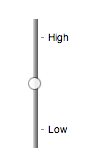
Finally, here is an example of a range control with two labeled values:
<input type="range" name="a" list="a-values">
<datalist id="a-values">
<option value="10" label="Low">
<option value="90" label="High">
</datalist>
With styles that make the control draw vertically, it might look as follows:
In this state, the range and step constraints are enforced even during user input, and there is no way to set the value to the empty string.
The min attribute, if specified, must have a value that is
a valid floating-point number. The default
minimum is 0. The max attribute, if specified, must
have a value that is a valid floating-point number. The default maximum is 100.
The step scale factor is
1. The default step is 1 (allowing only
integers, unless the min attribute has a non-integer
value).
The algorithm to convert a string to a number, given a string input, is as follows: If applying the rules for parsing floating-point number values to input results in an error, then return an error; otherwise, return the resulting number.
The algorithm to convert a number to a string, given a number input, is as follows: Return the best representation, as a floating-point number, of input.
The following common input element content attributes, IDL attributes, and
methods apply to the element:
autocomplete,
list,
max,
min, and
step content attributes;
list,
value, and
valueAsNumber IDL attributes;
stepDown() and
stepUp() methods.
The value IDL attribute is in mode value.
The input and change events apply.
The following content attributes must not be specified and do not apply to the
element:
accept,
alt,
checked,
dirname,
formaction,
formenctype,
formmethod,
formnovalidate,
formtarget,
height,
maxlength,
minlength,
multiple,
pattern,
placeholder,
readonly,
required,
size,
src, and
width.
The following IDL attributes and methods do not apply to the element:
checked,
files,
selectionStart,
selectionEnd,
selectionDirection, and
valueAsDate IDL attributes;
select(),
setRangeText(), and
setSelectionRange() methods.
type=color)Support in all current engines.
When an input element's type attribute is in
the Color state, the rules in this section apply.
The input element represents a color well control, for setting the
element's value to a string representing a simple
color.
In this state, there is always a color picked, and there is no way to set the value to the empty string.
If the element is mutable, the user agent should allow the user to change the color represented by its value, as obtained from applying the rules for parsing simple color values to it. User agents must not allow the user to set the value to a string that is not a valid lowercase simple color. If the user agent provides a user interface for selecting a color, then the value must be set to the result of using the rules for serializing simple color values to the user's selection. User agents must not allow the user to set the value to the empty string.
Constraint validation: While the user interface describes input that the user agent cannot convert to a valid lowercase simple color, the control is suffering from bad input.
The value attribute, if specified and not empty, must
have a value that is a valid simple color.
The value sanitization algorithm is as follows: If the value of the element is a valid simple color, then
set it to the value of the element converted to ASCII
lowercase; otherwise, set it to the string "#000000".
The following common input element content attributes and IDL attributes apply to the element:
autocomplete and
list content attributes;
list and
value IDL attributes;
select() method.
The value IDL attribute is in mode value.
The input and change events apply.
The following content attributes must not be specified and do not apply to the
element:
accept,
alt,
checked,
dirname,
formaction,
formenctype,
formmethod,
formnovalidate,
formtarget,
height,
max,
maxlength,
min,
minlength,
multiple,
pattern,
placeholder,
readonly,
required,
size,
src,
step, and
width.
The following IDL attributes and methods do not apply to the element:
checked,
files,
selectionStart,
selectionEnd,
selectionDirection,
valueAsDate and,
valueAsNumber IDL attributes;
setRangeText(),
setSelectionRange(),
stepDown(), and
stepUp() methods.
type=checkbox)Support in all current engines.
When an input element's type attribute is in
the Checkbox state, the rules in this section
apply.
The input element represents a two-state control that represents the
element's checkedness state. If the element's checkedness state is true, the control represents a positive
selection, and if it is false, a negative selection. If the element's indeterminate IDL attribute is set to true, then the
control's selection should be obscured as if the control was in a third, indeterminate, state.
The control is never a true tri-state control, even if the element's indeterminate IDL attribute is set to true. The indeterminate IDL attribute only gives the appearance of a
third state.
The input activation behavior is to run the following steps:
If the element is not connected, then return.
Fire an event named input at the element with the bubbles and composed
attributes initialized to true.
Fire an event named change at the element with the bubbles attribute initialized to true.
Constraint validation: If the element is required and its checkedness is false, then the element is suffering from being missing.
indeterminate [ = value ]When set, overrides the rendering of checkbox controls so that the current value is not visible.
The following common input element content attributes and IDL attributes apply to the element:
checked, and
required content attributes;
checked and
value IDL attributes.
The value IDL attribute is in mode default/on.
The input and change events apply.
The following content attributes must not be specified and do not apply to the
element:
accept,
alt,
autocomplete,
dirname,
formaction,
formenctype,
formmethod,
formnovalidate,
formtarget,
height,
list,
max,
maxlength,
min,
minlength,
multiple,
pattern,
placeholder,
readonly,
size,
src,
step, and
width.
The following IDL attributes and methods do not apply to the element:
files,
list,
selectionStart,
selectionEnd,
selectionDirection,
valueAsDate, and
valueAsNumber IDL attributes;
select(),
setRangeText(),
setSelectionRange(),
stepDown(), and
stepUp() methods.
type=radio)Support in all current engines.
When an input element's type attribute is in
the Radio Button state, the rules in this section
apply.
The input element represents a control that, when used in conjunction
with other input elements, forms a radio button group in which only one
control can have its checkedness state set to true. If
the element's checkedness state is true, the control
represents the selected control in the group, and if it is false, it indicates a control in the
group that is not selected.
The radio button group that contains an input element
a also contains all the other input elements b that fulfill all
of the following conditions:
input element b's type attribute is in the Radio
Button state.name attribute, their name attributes are not empty, and the value of a's name attribute equals the value of b's name attribute.A tree must not contain an input element whose radio button group contains only that element.
When any of the following phenomena occur, if the element's checkedness state is true after the occurrence, the checkedness state of all the other elements in the same radio button group must be set to false:
name attribute is set, changed, or
removed.The input activation behavior is to run the following steps:
If the element is not connected, then return.
Fire an event named input at the element with the bubbles and composed
attributes initialized to true.
Fire an event named change at the element with the bubbles attribute initialized to true.
Constraint validation: If an element in the radio button group is required, and all of the
input elements in the radio button group have a
checkedness that is false, then the element is
suffering from being missing.
The following example, for some reason, has specified that puppers are both required and disabled:
<form>
 <p><label><input type="radio" name="dog-type" value="pupper" required disabled> Pupper</label>
 <p><label><input type="radio" name="dog-type" value="doggo"> Doggo</label>
 <p><button>Make your choice</button>
</form>
If the user tries to submit this form without first selecting "Doggo", then both
input elements will be suffering from being missing, since an element
in the radio button group is required
(viz. the first element), and both of the elements in the radio button group have a false checkedness.
On the other hand, if the user selects "Doggo" and then submits the form, then neither
input element will be suffering from being missing, since while one of
them is required, not all of them have a false checkedness.
If none of the radio buttons in a radio button group are checked, then they will all be initially unchecked in the interface, until such time as one of them is checked (either by the user or by script).
The following common input element content attributes and IDL attributes apply to the element:
checked and
required content attributes;
checked and
value IDL attributes.
The value IDL attribute is in mode default/on.
The input and change events apply.
The following content attributes must not be specified and do not apply to the
element:
accept,
alt,
autocomplete,
dirname,
formaction,
formenctype,
formmethod,
formnovalidate,
formtarget,
height,
list,
max,
maxlength,
min,
minlength,
multiple,
pattern,
placeholder,
readonly,
size,
src,
step, and
width.
The following IDL attributes and methods do not apply to the element:
files,
list,
selectionStart,
selectionEnd,
selectionDirection,
valueAsDate, and
valueAsNumber IDL attributes;
select(),
setRangeText(),
setSelectionRange(),
stepDown(), and
stepUp() methods.
type=file)Support in all current engines.
When an input element's type attribute is in
the File Upload state, the rules in this section
apply.
The input element represents a list of selected files, each file consisting of a file
name, a file type, and a file body (the contents of the file).
File names must not contain path components, even in the case that a user has selected an entire directory hierarchy or multiple files with the same name from different directories. Path components, for the purposes of the File Upload state, are those parts of file names that are separated by U+005C REVERSE SOLIDUS character (\) characters.
Unless the multiple attribute is set, there must be
no more than one file in the list of selected
files.
The element's input activation behavior is to run the following steps:
If the algorithm is invoked when the element's Window object does not have
transient activation, then return without doing anything else.
Run these steps in parallel:
Optionally, wait until any prior execution of this algorithm has terminated.
Display a prompt to the user requesting that the user specify some files. If the multiple attribute is not set, there must be no more than
one file selected; otherwise, any number may be selected. Files can be from the filesystem or
created on the fly, e.g., a picture taken from a camera connected to the user's
device.
Wait for the user to have made their selection.
Update the file selection for the input element.
If the element is mutable, the user agent should allow the user to change the files on the list in other ways also, e.g., adding or removing files by drag-and-drop. When the user does so, the user agent must update the file selection for the element.
If the element is not mutable, the user agent must not allow the user to change the element's selection.
To update the file selection for an element element:
Queue an element task on the user interaction task source given element and the following steps:
Update element's selected files so that it represents the user's selection.
Fire an event named input at the input element, with the bubbles and composed
attributes initialized to true.
Fire an event named change at the input element, with the bubbles attribute initialized to true.
Constraint validation: If the element is required and the list of selected files is empty, then the element is suffering from being missing.
Support in all current engines.
The accept
attribute may be specified to provide user agents with a hint of what file types will be
accepted.
If specified, the attribute must consist of a set of comma-separated tokens, each of which must be an ASCII case-insensitive match for one of the following:
audio/*"video/*"image/*"The tokens must not be ASCII case-insensitive matches for any of the other tokens (i.e. duplicates are not allowed). To obtain the list of tokens from the attribute, the user agent must split the attribute value on commas.
User agents may use the value of this attribute to display a more appropriate user interface
than a generic file picker. For instance, given the value image/*, a user
agent could offer the user the option of using a local camera or selecting a photograph from their
photo collection; given the value audio/*, a user agent could offer the user
the option of recording a clip using a headset microphone.
User agents should prevent the user from selecting files that are not accepted by one (or more) of these tokens.
Authors are encouraged to specify both any MIME types and any corresponding extensions when looking for data in a specific format.
For example, consider an application that converts Microsoft Word documents to Open Document Format files. Since Microsoft Word documents are described with a wide variety of MIME types and extensions, the site can list several, as follows:
<input type="file" accept=".doc,.docx,.xml,application/msword,application/vnd.openxmlformats-officedocument.wordprocessingml.document">On platforms that only use file extensions to describe file types, the extensions listed here can be used to filter the allowed documents, while the MIME types can be used with the system's type registration table (mapping MIME types to extensions used by the system), if any, to determine any other extensions to allow. Similarly, on a system that does not have file names or extensions but labels documents with MIME types internally, the MIME types can be used to pick the allowed files, while the extensions can be used if the system has an extension registration table that maps known extensions to MIME types used by the system.
Extensions tend to be ambiguous (e.g. there are an untold number of formats
that use the ".dat" extension, and users can typically quite easily rename
their files to have a ".doc" extension even if they are not Microsoft Word
documents), and MIME types tend to be unreliable (e.g. many formats have no formally registered
types, and many formats are in practice labeled using a number of different MIME types). Authors
are reminded that, as usual, data received from a client should be treated with caution, as it may
not be in an expected format even if the user is not hostile and the user agent fully obeyed the
accept attribute's requirements.
For historical reasons, the value IDL attribute prefixes
the file name with the string "C:\fakepath\". Some legacy user agents
actually included the full path (which was a security vulnerability). As a result of this,
obtaining the file name from the value IDL attribute in a
backwards-compatible way is non-trivial. The following function extracts the file name in a
suitably compatible manner:
function extractFilename(path) {
  if (path.substr(0, 12) == "C:\\fakepath\\")
    return path.substr(12); // modern browser
  var x;
  x = path.lastIndexOf('/');
  if (x >= 0) // Unix-based path
    return path.substr(x+1);
  x = path.lastIndexOf('\\');
  if (x >= 0) // Windows-based path
    return path.substr(x+1);
  return path; // just the file name
}
This can be used as follows:
<p><input type=file name=image onchange="updateFilename(this.value)"></p>
<p>The name of the file you picked is: <span id="filename">(none)</span></p>
<script>
 function updateFilename(path) {
   var name = extractFilename(path);
   document.getElementById('filename').textContent = name;
 }
</script>
The following common input element content attributes and IDL attributes apply to the element:
accept,
multiple, and
required content attributes;
files and
value IDL attributes;
select() method.
The value IDL attribute is in mode filename.
The input and change events apply.
The following content attributes must not be specified and do not apply to the
element:
alt,
autocomplete,
checked,
dirname,
formaction,
formenctype,
formmethod,
formnovalidate,
formtarget,
height,
list,
max,
maxlength,
min,
minlength,
pattern,
placeholder,
readonly,
size,
src,
step, and
width.
The element's value attribute must be omitted.
The following IDL attributes and methods do not apply to the element:
checked,
list,
selectionStart,
selectionEnd,
selectionDirection,
valueAsDate, and
valueAsNumber IDL attributes;
setRangeText(),
setSelectionRange(),
stepDown(), and
stepUp() methods.
type=submit)Support in all current engines.
When an input element's type attribute is in
the Submit Button state, the rules in this section
apply.
 The
The input element represents a button that, when activated, submits the
form. If the element has a value attribute,
the button's label must be the value of that attribute; otherwise, it must be an
implementation-defined string that means "Submit" or some such. The element is
a button, specifically a submit button.
Since the default label is implementation-defined, and the width of the button typically depends on the button's label, the button's width can leak a few bits of fingerprintable information. These bits are likely to be strongly correlated to the identity of the user agent and the user's locale.
The element's input activation behavior is as follows: if the element has a
form owner, and the element's node document is fully
active, submit the form owner from
the input element; otherwise, do nothing.
The formaction, formenctype, formmethod, formnovalidate, and formtarget attributes are attributes for form
submission.
The formnovalidate attribute can be
used to make submit buttons that do not trigger the constraint validation.
The following common input element content attributes and IDL attributes apply to the element:
formaction,
formenctype,
formmethod,
formnovalidate, and
formtarget content attributes;
value IDL attribute.
The value IDL attribute is in mode default.
The following content attributes must not be specified and do not apply to the
element:
accept,
alt,
autocomplete,
checked,
dirname,
height,
list,
max,
maxlength,
min,
minlength,
multiple,
pattern,
placeholder,
readonly,
required,
size,
src,
step, and
width.
The following IDL attributes and methods do not apply to the element:
checked,
files,
list,
selectionStart,
selectionEnd,
selectionDirection,
valueAsDate, and
valueAsNumber IDL attributes;
select(),
setRangeText(),
setSelectionRange(),
stepDown(), and
stepUp() methods.
The input and change events do not apply.
type=image)Support in all current engines.
When an input element's type attribute is in
the Image Button state, the rules in this section
apply.
The input element represents either an image from which a user can
select a coordinate and submit the form, or alternatively a button from which the user can submit
the form. The element is a button, specifically a submit button.
The coordinate is sent to the server during form submission by sending two entries for the element, derived from the name
of the control but with ".x" and ".y" appended to
the name with the x and y components of the coordinate respectively.
The image is given by the src attribute. The src
attribute must be present, and must contain a valid non-empty URL potentially surrounded by
spaces referencing a non-interactive, optionally animated, image resource that is neither
paged nor scripted.
When any of the these events occur
input element's type attribute is
first set to the Image Button state (possibly when
the element is first created), and the src attribute is
presentinput element's type attribute is
changed back to the Image Button state, and the src attribute is present, and its value has changed since the last
time the type attribute was in the Image Button stateinput element's type attribute is in
the Image Button state, and the src attribute is set or changedthen unless the user agent cannot support images, or its support for images has been disabled,
or the user agent only fetches images on demand, or the src
attribute's value is the empty string, the user agent must parse the value of the src
attribute value, relative to the element's node document, and if that is successful,
then:
Let request be a new request whose
url is the resulting URL record,
client is the element's node document's
relevant settings object, destination is "image", credentials mode is "include", and whose use-URL-credentials flag is set.
Fetch request.
Fetching the image must delay the load event of the element's node document until the task that is queued by the networking task source once the resource has been fetched (defined below) has been run.
If the image was successfully obtained, with no network errors, and the image's type is a supported image type, and the image is a valid image of that type, then the image is said to be available. If this is true before the image is completely downloaded, each task that is queued by the networking task source while the image is being fetched must update the presentation of the image appropriately.
The user agent should apply the image sniffing rules to determine the type of the image, with the image's associated Content-Type headers giving the official type. If these rules are not applied, then the type of the image must be the type given by the image's associated Content-Type headers.
User agents must not support non-image resources with the input element. User
agents must not run executable code embedded in the image resource. User agents must only display
the first page of a multipage resource. User agents must not allow the resource to act in an
interactive fashion, but should honor any animation in the resource.
The task that is queued
by the networking task source once the resource has been fetched, must, if the
download was successful and the image is available,
queue an element task on the user interaction task source given the
input element to fire an event named load at the input element; and otherwise, if the fetching
process fails without a response from the remote server, or completes but the image is not a valid
or supported image, queue an element task on the user interaction task
source given the input element to fire an
event named error on the input element.
The alt attribute
provides the textual label for the button for users and user agents who cannot use the image. The
alt attribute must be present, and must contain a non-empty
string giving the label that would be appropriate for an equivalent button if the image was
unavailable.
The input element supports dimension attributes.
If the src attribute is set, and the image is available and the user agent is configured to display that image,
then: The element represents a control for selecting a coordinate from the image specified by the
src attribute; if the element is mutable, the user agent should allow the user to select this coordinate, and the element's input
activation behavior is as follows: if the element has a form owner, and the
element's node document is fully active, take the user's selected coordinate, and submit the input element's form owner
from the input element. If the user activates the control without explicitly
selecting a coordinate, then the coordinate (0,0) must be assumed.
Otherwise, the element represents a submit button whose label is given by the
value of the alt attribute; the element's input
activation behavior is as follows: if the element has a form owner, and the
element's node document is fully active, set the selected coordinate to (0,0), and submit the input element's form
owner from the input element.
In either case, if the element has no form owner or the element's node document is not fully active, then its input activation behavior must be to do nothing..
The selected coordinate must consist of an x-component and a y-component. The coordinates represent the position relative to the edge of the image, with the coordinate space having the positive x direction to the right, and the positive y direction downwards.
The x-component must be a valid integer representing a number x in the range −(borderleft+paddingleft) ≤ x ≤ width+borderright+paddingright, where width is the rendered width of the image, borderleft is the width of the border on the left of the image, paddingleft is the width of the padding on the left of the image, borderright is the width of the border on the right of the image, and paddingright is the width of the padding on the right of the image, with all dimensions given in CSS pixels.
The y-component must be a valid integer representing a number y in the range −(bordertop+paddingtop) ≤ y ≤ height+borderbottom+paddingbottom, where height is the rendered height of the image, bordertop is the width of the border above the image, paddingtop is the width of the padding above the image, borderbottom is the width of the border below the image, and paddingbottom is the width of the padding below the image, with all dimensions given in CSS pixels.
Where a border or padding is missing, its width is zero CSS pixels.
The formaction, formenctype, formmethod, formnovalidate, and formtarget attributes are attributes for form
submission.
width [ = value ]height [ = value ]These attributes return the actual rendered dimensions of the image, or zero if the dimensions are not known.
They can be set, to change the corresponding content attributes.
The following common input element content attributes and IDL attributes apply to the element:
alt,
formaction,
formenctype,
formmethod,
formnovalidate,
formtarget,
height,
src, and
width content attributes;
value IDL attribute.
The value IDL attribute is in mode default.
The following content attributes must not be specified and do not apply to the
element:
accept,
autocomplete,
checked,
dirname,
list,
max,
maxlength,
min,
minlength,
multiple,
pattern,
placeholder,
readonly,
required,
size, and
step.
The element's value attribute must be omitted.
The following IDL attributes and methods do not apply to the element:
checked,
files,
list,
selectionStart,
selectionEnd,
selectionDirection,
valueAsDate, and
valueAsNumber IDL attributes;
select(),
setRangeText(),
setSelectionRange(),
stepDown(), and
stepUp() methods.
The input and change events do not apply.
Many aspects of this state's behavior are similar to the behavior of the
img element. Readers are encouraged to read that section, where many of the same
requirements are described in more detail.
Take the following form:
<form action="process.cgi">
 <input type=image src=map.png name=where alt="Show location list">
</form>
If the user clicked on the image at coordinate (127,40) then the URL used to submit the form
would be "process.cgi?where.x=127&where.y=40".
(In this example, it's assumed that for users who don't see the map, and who instead just see a button labeled "Show location list", clicking the button will cause the server to show a list of locations to pick from instead of the map.)
type=reset)Support in all current engines.
When an input element's type attribute is in
the Reset Button state, the rules in this section
apply.
The input element represents a button that, when activated, resets the
form. If the element has a value attribute,
the button's label must be the value of that attribute; otherwise, it must be an
implementation-defined string that means "Reset" or some such. The element is
a button.
Since the default label is implementation-defined, and the width of the button typically depends on the button's label, the button's width can leak a few bits of fingerprintable information. These bits are likely to be strongly correlated to the identity of the user agent and the user's locale.
The element's input activation behavior, if the element has a form owner and the element's node document is fully active, is to reset the form owner; otherwise, it is to do nothing.
Constraint validation: The element is barred from constraint validation.
The value IDL attribute applies to this element and is in mode default.
The following content attributes must not be specified and do not apply to the
element:
accept,
alt,
autocomplete,
checked,
dirname,
formaction,
formenctype,
formmethod,
formnovalidate,
formtarget,
height,
list,
max,
maxlength,
min,
minlength,
multiple,
pattern,
placeholder,
readonly,
required,
size,
src,
step, and
width.
The following IDL attributes and methods do not apply to the element:
checked,
files,
list,
selectionStart,
selectionEnd,
selectionDirection,
valueAsDate, and
valueAsNumber IDL attributes;
select(),
setRangeText(),
setSelectionRange(),
stepDown(), and
stepUp() methods.
The input and change events do not apply.
type=button)Support in all current engines.
When an input element's type attribute is in
the Button state, the rules in this section apply.
The input element represents a button with no default behavior. A
label for the button must be provided in the value
attribute, though it may be the empty string. If the element has a value attribute, the button's label must be the value of that
attribute; otherwise, it must be the empty string. The element is a button.
The element has no input activation behavior.
Constraint validation: The element is barred from constraint validation.
The value IDL attribute applies to this element and is in mode default.
The following content attributes must not be specified and do not apply to the
element:
accept,
alt,
autocomplete,
checked,
dirname,
formaction,
formenctype,
formmethod,
formnovalidate,
formtarget,
height,
list,
max,
maxlength,
min,
minlength,
multiple,
pattern,
placeholder,
readonly,
required,
size,
src,
step, and
width.
The following IDL attributes and methods do not apply to the element:
checked,
files,
list,
selectionStart,
selectionEnd,
selectionDirection,
valueAsDate, and
valueAsNumber IDL attributes;
select(),
setRangeText(),
setSelectionRange(),
stepDown(), and
stepUp() methods.
The input and change events do not apply.
This section is non-normative.
日期、时间和数字控件展示给用户的格式与提交表单使用的格式相独立。
鼓励浏览器根据 input 元素的 language 或用户偏好中的语言环境暗示的惯例
来展示日期、时间和数字的 UI。使用页面的语言环境可以确保页面提供的数据一致。
例如,如果一个美式英语区域的页面说 Cirque De Soleil 节目将会在 02/03 播出,但浏览器设置了英式英语区域, 在购票日期选择中会把日期显示为 03/02,这会让用户很困惑。 使用页面的区域设置至少可以确保日期在所有地方都以同一种格式显示。 (当然用户仍然可能迟到一个月,但对于这样的文化差异只能做到这个地步了...)
input 元素属性这些属性只 适用于
input 元素的 type
属性所处的状态定义了这个属性 适用 的情况。
当一个属性 不适用于 input 元素时,
用户代理必须 忽略 这个属性,忽略下面的要求和定义。
maxlength and minlength attributesSupport in all current engines.
The maxlength
attribute, when it applies, is a
form control maxlength
attribute.
Support in all current engines.
The minlength
attribute, when it applies, is a
form control minlength
attribute.
If the input element has a maximum allowed value length, then the
length of the value of the element's value
attribute must be equal to or less than the element's maximum allowed value
length.
The following extract shows how a messaging client's text entry could be arbitrarily restricted to a fixed number of characters, thus forcing any conversation through this medium to be terse and discouraging intelligent discourse.
<label>What are you doing? <input name=status maxlength=140></label>Here, a password is given a minimum length:
<p><label>Username: <input name=u required></label>
<p><label>Password: <input name=p required minlength=12></label>size 属性size 属性给出了
在用户编辑元素的 值 的时候,用户代理允许用户看到的字符数目。
指定 size 属性时,值必须是一个大于零的
合法的非负整数。
如果指定了这个属性,就必须使用 解析非负整数的规则 解析它的值, 如果结果是一个大于零的数字,用户代理应该确保至少那么多字符可见。
size IDL 属性
仅限于大于零的非负整数,
默认值为 20。
readonly 属性Support in all current engines.
readonly 属性是一个
布尔属性 用来控制用户是否可以编辑这个表单控件。
指定后这个元素就不 可变 了。
约束验证:如果在 input 元素上指定了
readonly 属性,这个元素就
禁止约束验证。
disabled 与 readonly 之间的区别是 read-only 控件仍然运作,
但 disabled 控件通常不具有控件的功能。这在本规范的其他地方会对
disabled 的概念的形式化要求进行详细介绍。
(例如元素的 激活行为,是否是一个
可聚焦区域,或何时
构造项目列表)。
禁用控件的任何其他与用户交互相关的行为都不在本规范中定义,比如文本是否可以选择和拷贝。
只有文本控件可以做成只读,因为其他控件(比如复选框和按钮)的只读和禁用没什么区别,
所以 readonly 属性
不适用。
在下面的例子中,已经存在的产品标识不可修改,但仍然可以显示为表单的一部分, 只是为了与显示新产品(它的标识还未填写)的行保持一致。
<form action="products.cgi" method="post" enctype="multipart/form-data">
 <table>
  <tr> <th> Product ID <th> Product name <th> Price <th> Action
  <tr>
   <td> <input readonly="readonly" name="1.pid" value="H412">
   <td> <input required="required" name="1.pname" value="Floor lamp Ulke">
   <td> $<input required="required" type="number" min="0" step="0.01" name="1.pprice" value="49.99">
   <td> <button formnovalidate="formnovalidate" name="action" value="delete:1">Delete</button>
  <tr>
   <td> <input readonly="readonly" name="2.pid" value="FG28">
   <td> <input required="required" name="2.pname" value="Table lamp Ulke">
   <td> $<input required="required" type="number" min="0" step="0.01" name="2.pprice" value="24.99">
   <td> <button formnovalidate="formnovalidate" name="action" value="delete:2">Delete</button>
  <tr>
   <td> <input required="required" name="3.pid" value="" pattern="[A-Z0-9]+">
   <td> <input required="required" name="3.pname" value="">
   <td> $<input required="required" type="number" min="0" step="0.01" name="3.pprice" value="">
   <td> <button formnovalidate="formnovalidate" name="action" value="delete:3">Delete</button>
 </table>
 <p> <button formnovalidate="formnovalidate" name="action" value="add">Add</button> </p>
 <p> <button name="action" value="update">Save</button> </p>
</form>
required 属性required 属性是一个
布尔属性。当指定时这个元素就是 必要的。
约束验证:如果这个元素是 必要的,
且它的 value IDL 属性
适用 且处于 value 模式,而且该元素是 可变的,而且该元素的 value 为空字符串,那么这个元素就
处于缺失错误状态。
下面的表单有两个必要字段,一个是邮件地址另一个是密码。 第三个字段只在用户输入与密码字段同样的密码时才有效。
<h1>Create new account</h1>
<form action="/newaccount" method=post
      oninput="up2.setCustomValidity(up2.value != up.value ? 'Passwords do not match.' : '')">
 <p>
  <label for="username">E-mail address:</label>
  <input id="username" type=email required name=un>
 <p>
  <label for="password1">Password:</label>
  <input id="password1" type=password required name=up>
 <p>
  <label for="password2">Confirm password:</label>
  <input id="password2" type=password name=up2>
 <p>
  <input type=submit value="Create account">
</form>
对于单选按钮,如果 分组 中任意一个单选按钮被选中,
required 属性就会被满足。
因此在下面的例子中,可以选中任意一个单选按钮,而不仅仅是标记为必选的那个:
<fieldset>
 <legend>Did the movie pass the Bechdel test?</legend>
 <p><label><input type="radio" name="bechdel" value="no-characters"> No, there are not even two female characters in the movie. </label>
 <p><label><input type="radio" name="bechdel" value="no-names"> No, the female characters never talk to each other. </label>
 <p><label><input type="radio" name="bechdel" value="no-topic"> No, when female characters talk to each other it's always about a male character. </label>
 <p><label><input type="radio" name="bechdel" value="yes" required> Yes. </label>
 <p><label><input type="radio" name="bechdel" value="unknown"> I don't know. </label>
</fieldset>
为避免困惑 关于是否 单选按钮分组 是否是必选的, 鼓励作者在组中的所有单选按钮上都指定属性,其实通常也鼓励作者避免这种没有初始选中的单选按钮分组, 因为用户无法返回到这个状态,因此也通常被认为是糟糕的用户界面。
multiple 属性Support in all current engines.
multiple 属性是一个
布尔属性,表示是否允许用户指定多个值。
下面的片段展示了 e-mail 客户端的 "To" 字符串如何接受多个 e-mail 地址。
<label>To: <input type=email multiple name=to></label>
如果用户的联系人数据库中有这样两个朋友:"Spider-Man" (地址为"spider@parker.example.net")和 "Scarlet Witch"(地址为"scarlet@avengers.example.net"), 在用户输入了 "s" 后,用户代理可能会给用户建议这些 e-mail 地址。

这个页面可能会链接到用户的联系人数据库:
<label>To: <input type=email multiple name=to list=contacts></label>
...
<datalist id="contacts">
 <option value="hedral@damowmow.com">
 <option value="pillar@example.com">
 <option value="astrophy@cute.example">
 <option value="astronomy@science.example.org">
</datalist>
假设用户在文本控件中输入了 "bob@example.net",然后开始键入第二个
e-mail 地址,开头是 "s"。用户代理可能会显示前面提到的两个朋友,
以及 datalist 元素给出的 "astrophy" 和 "astronomy" 两个值。

下面的片段展示了 e-mail 客户端的 "Attachments" 字段是如何接受多个文件上传的。
<label>Attachments: <input type=file multiple name=att></label>
pattern 属性pattern 属性指定了
该控件的 值 的正则表达式,
或者当设置了 multiple 属性并且输入控件 适用这个属性 时,
就要检查这个控件的值 值。
如果指定了这个属性,它的值必须匹配 JavaScript Pattern 生成式。
如果 input 元素设置了 pattern
属性,且这个属性的值可以作为 JavaScript 正则表达式(只带 "u" 标志)成功地编译,
那么结果正则表达式就是这个元素的
编译后的模式正则表达式。
如果这个元素没有这种属性,或者其属性值不能成功编译,那么这个元素就没有
编译后的模式正则表达式。[JAVASCRIPT]
如果值不能成功编译,鼓励用户代理把这个日志打到开发控制台来帮助调试。
约束验证:如果这个元素的 值
不是空字符串,或者元素没有指定 multiple 属性,
或者它 不适用 于 input 元素的 type 属性的当前状态,且这个元素有
编译后的模式正则表达式
但这个正则不匹配元素的 值,那么就说这个元素
处于模式不匹配错误状态。
约束验证:如果这个元素的 value 不是空字符串,
且这个元素指定了 multiple 属性,
且 适用于 input 元素,
且该元素有一个 编译后的模式正则表达式,
但这个正则不匹配元素的每一个值 values,
那么这个元素 处于模式不匹配错误状态。
把 编译后的模式正则表达式 与字符串进行匹配时,必须把它的开始位置对准字符串的开始位置,它的结尾对准字符串的结尾位置。
这意味着用于这个属性的正则表达式语言与用于 JavaScript 的一样,除了
pattern 属性匹配的是整个值,而不是一个子集
(有些像是在前面添加一个 ^(?:,在后面加一个 )$)
当一个 input 元素设置有 pattern 属性时,
作者应该引入一个 title 属性来描述这个模式。
如果有的话,当用户代理提示用户模式不匹配的时候,或者其他任何适当的时候,都可以使用这个属性的内容。
比如显示为一个 tooltip,或者在控件 获得焦点 时由辅助技术读出来。
例如下面的片段:
<label> Part number:
 <input pattern="[0-9][A-Z]{3}" name="part"
        title="A part number is a digit followed by three uppercase letters."/>
</label>
...could cause the UA to display an alert such as:
A part number is a digit followed by three uppercase letters.
You cannot submit this form when the field is incorrect.
当一个控件有 pattern 属性时,如果用了 title 属性,它就必须描述这个模式。
也可以包含额外的信息,只要是帮助用户填写这个控件的。否则辅助技术将受到影响。
假如 title 属性包含控件标题, 辅助技术可能会说 你输入的文字不匹配要求的模式:生日,这根本没用。
UA 仍然可以在没错误的情况下显示 title
(例如作为悬停在空间上时的 tooltip),这样作者应该注意不要把
title 的文字写得像是已经发生了错误一样。
min 和 max 属性有些表单控件可以有显式的约束来限制用户提供的值的范围。 通常,这样的范围将是线性的并且是连续的。 表单控件可能 有周期性的范围 但最宽可能的范围是有限的, 作者可以显式地设置一个横跨边界的范围。
具体而言,最广泛的
type=time 控件最宽的范围是午夜到午夜(24小时),
作者可以设置连续线性的范围(比如9pm到11pm),也可以设置跨过午夜的不连续的范围(比如 11pm 到 1am)。
min 和
max 属性表示这个元素允许的值的范围。
它们的语法由定义 type
属性当前状态的章节定义。
如果这个元素有 min 属性,而且对
min 属性执行
字符串转换为数字算法
的结果是一个数字,那么这个数字就是该元素的 最小值;
否则,如果 type 属性的当前状态定义了 默认最小值,那么这就是 最小值;否则,这个元素就没有 最小值。
如果这个元素有 max 属性,而且对
max 属性执行
字符串转换为数字算法
的结果是一个数字,那么这个数字就是该元素的 最大值;
否则,如果 type 属性的当前状态定义了 默认最大值,那么这就是 最大值;否则,这个元素就没有 最大值。
如果这个元素没有 周期性的范围,
max 属性的值(最大值)不得小于 min 属性的值(最小值)。
如果没有 周期性的范围 的元素的 最大值 小于它的 最小值,只要这个元素有 值, 那么它或者 处于下溢出错误状态, 或者 处于上溢出错误状态。
如果元素 有周期性的范围 且它的 最大值 小于 最小值, 那么它就 有反转的范围。
如果一个元素定义了 最小值 或 最大值, 那么它就 有范围限制。
约束验证:当元素有 最小值 而且没有 反转范围,而且对元素的 value 给出的字符串执行 字符串转换为数字算法 得到的结果是一个数字, 而且得到的这个数字小于 最小值,这个元素就 处于下溢出错误状态。
约束验证:当元素有 最大值 而且没有 反转范围,而且对元素的 value 给出的字符串执行 字符串转换为数字算法 得到的结果是一个数字, 而且得到的这个数字大于 最大值,这个元素就 处于上溢出错误状态。
约束验证:当元素 有反转范围 时, 如果在该元素的 value 给出的字符串上执行 字符串转换为数字算法 得到的结果是一个数字, 而且这个数字大于 最大值 且 小于 最小值,该元素就同时 处于下溢出状态 和 上溢出状态。
下面的日期控件限制输入在 1980 年之前:
<input name=bday type=date max="1979-12-31">
下面的数字控件限制输入为大于 0 的整数:
<input name=quantity required="" type="number" min="1" value="1">
下面的时间控件限制输入为 9pm 到 6am 之间的分钟,默认为午夜:
<input name="sleepStart" type=time min="21:00" max="06:00" step="60" value="00:00">
step attributeThe step attribute
indicates the granularity that is expected (and required) of the value or values, by
limiting the allowed values. The section that defines the type attribute's current state also defines the default step, the step scale factor, and in some cases the default step base, which are used in processing the
attribute as described below.
The step attribute, if specified, must either have a
value that is a valid floating-point number that parses to a number that is greater than zero, or must have a
value that is an ASCII case-insensitive match for the string "any".
The attribute provides the allowed value step for the element, as follows:
If the attribute does not apply, then there is no allowed value step.
Otherwise, if the attribute is absent, then the allowed value step is the default step multiplied by the step scale factor.
Otherwise, if the attribute's value is an ASCII case-insensitive match for the
string "any", then there is no allowed
value step.
Otherwise, if the rules for parsing floating-point number values, when they are applied to the attribute's value, return an error, zero, or a number less than zero, then the allowed value step is the default step multiplied by the step scale factor.
Otherwise, the allowed value step is the number returned by the rules for parsing floating-point number values when they are applied to the attribute's value, multiplied by the step scale factor.
The step base is the value returned by the following algorithm:
If the element has a min content attribute, and the
result of applying the algorithm to convert a
string to a number to the value of the min content
attribute is not an error, then return that result.
If the element has a value content attribute, and
the result of applying the algorithm to convert
a string to a number to the value of the value
content attribute is not an error, then return that result.
If a default step base is defined for
this element given its type attribute's state, then return
it.
Return zero.
Constraint validation: When the element has an allowed value step, and the result of applying the algorithm to convert a string to a number to the string given by the element's value is a number, and that number subtracted from the step base is not an integral multiple of the allowed value step, the element is suffering from a step mismatch.
The following range control only accepts values in the range 0..1, and allows 256 steps in that range:
<input name=opacity type=range min=0 max=1 step=0.00392156863>The following control allows any time in the day to be selected, with any accuracy (e.g. thousandth-of-a-second accuracy or more):
<input name=favtime type=time step=any>Normally, time controls are limited to an accuracy of one minute.
list 属性list 属性用于识别
给用户列出了建议的预定义选项的元素。
如果指定了这个属性,它的值必须是同一个 树
中的 datalist 元素的 ID。
建议来源元素 是在 树 中的
按照 树序 的第一个 ID
属性等于 list 属性值的 datalist 元素。
如果没有 list 属性,或者没有这个
ID 的元素,或者第一个有这个 ID
的元素不是 datalist 元素,那就没有
建议来源元素。
如果有一个 建议来源元素,那么当用户代理
允许用户编辑这个 input 元素的 值 时,
用户代理应该把 建议来源元素
表示的建议以与控件类型相适应的方式提供给用户。
如果合适的话,用户代理应该使用建议的 label 和
value 来给用户标识建议。
如果建议很多,鼓励用户代理过滤 建议来源元素 表示的建议, (比如基于用户目前的输入)只显示最相关的那些。没有定义精确的阈值,但 4-7 个值是比较合理的。 如果是基于用户输入进行过滤,用户代理应该对建议的 label 和 value 进行子字符串匹配。
这个文本字段允许你选择一个JavaScript 函数类型。
<input type="text" list="function-types">
<datalist id="function-types">
  <option value="function">function</option>
  <option value="async function">async function</option>
  <option value="function*">generator function</option>
  <option value="=>">arrow function</option>
  <option value="async =>">async arrow function</option>
  <option value="async function*">async generator function</option>
</datalist>
对遵守以上建议的用户代理,label 和 value 可能会显示为:

然后键入 "arrow" 或 "=>" 将会把列表过滤为 "arrow function" 和 "async arrow function"。 键入 "generator" 或 "*" 将会把列表过滤为 "generator function" 和 "async generator function"。
与往常一样,用户代理可以自己决定什么样的用户界面适合特定的要求和特定的用户场景。 但这在历史上是实现方,Web 开发者,用户都容易混淆的地方, 所以我们给出了一些 "应该" 遵守的建议。
如何处理用户选择建议项取决于这个控件元素只接受单个值还是接受多个值:
multiple 属性
或者如果 multiple 属性 不适用type 属性处于 Email 状态且该元素设置了 multiple 属性当用户选择一项建议时,用户代理必须添加一个新项目到
input 元素的 值 中,
其值为选中建议项的 值,
或者把 input 元素的 值
中的既有项改为选中的建议项的 值 给出的值。
就像是用户自己添加了一项那个值,或者把既有项编辑成那个值。
应用上述哪个行为取决于用户代理定义的用户界面。
这个 URL 字段提供了一些建议。
<label>Homepage: <input name=hp type=url list=hpurls></label>
<datalist id=hpurls>
 <option value="https://www.google.com/" label="Google">
 <option value="https://www.reddit.com/" label="Reddit">
</datalist>
用户历史中的其他 URL 也可能显示;这取决于用户代理。
这个例子演示了如何使用自动完成列表功能设计一个表单,同时仍然能在旧用户代理上做有用的降级。
如果自动完成列表仅仅是一种帮助,而且对内容不重要。那么直接使用
datalist 元素和子 option 元素就足够了。
为了阻止在旧用户代理上渲染这些值,需要把它们放到
value 属性中,而不是内联。
<p>
 <label>
  Enter a breed:
  <input type="text" name="breed" list="breeds">
  <datalist id="breeds">
   <option value="Abyssinian">
   <option value="Alpaca">
   <!-- ... -->
  </datalist>
 </label>
</p>
但如果需要在旧 UA 显示这些值,fallback 内容可以放在 datalist 元素中,像这样:
<p>
 <label>
  Enter a breed:
  <input type="text" name="breed" list="breeds">
 </label>
 <datalist id="breeds">
  <label>
   or select one from the list:
   <select name="breed">
    <option value=""> (none selected)
    <option>Abyssinian
    <option>Alpaca
    <!-- ... -->
   </select>
  </label>
 </datalist>
</p>
fallback 内容只会在不支持 datalist 的 UA 显示。
但这些 option 会被所有 UA 检测到,即使它们不是 datalist 元素的子节点。
注意如果在 datalist 中用到的 option 元素处于
selected 状态,
它会在旧 UA 上默认选中(因为它会影响 select),
但它在支持 datalist 的 UA 上对 input 元素将不会有任何影响。
placeholder attributeElement/input#attr-placeholder
Support in all current engines.
The placeholder attribute represents a short
hint (a word or short phrase) intended to aid the user with data entry when the control has no
value. A hint could be a sample value or a brief description of the expected format. The
attribute, if specified, must have a value that contains no U+000A LINE FEED (LF) or U+000D
CARRIAGE RETURN (CR) characters.
The placeholder attribute should not be used as an
alternative to a label. For a longer hint or other advisory text, the title attribute is more appropriate.
These mechanisms are very similar but subtly different: the hint given by the
control's label is shown at all times; the short hint given in the placeholder attribute is shown before the user enters a
value; and the hint in the title attribute is shown when the user
requests further help.
User agents should present this hint to the user, after having stripped newlines from it, when the element's value is the empty string, especially if the control is not focused.
If a user agent normally doesn't show this hint to the user when the control is
focused, then the user agent should nonetheless show the hint for the control if it
was focused as a result of the autofocus attribute, since
in that case the user will not have had an opportunity to examine the control before focusing
it.
Here is an example of a mail configuration user interface that uses the placeholder attribute:
<fieldset>
 <legend>Mail Account</legend>
 <p><label>Name: <input type="text" name="fullname" placeholder="John Ratzenberger"></label></p>
 <p><label>Address: <input type="email" name="address" placeholder="john@example.net"></label></p>
 <p><label>Password: <input type="password" name="password"></label></p>
 <p><label>Description: <input type="text" name="desc" placeholder="My Email Account"></label></p>
</fieldset>
In situations where the control's content has one directionality but the placeholder needs to have a different directionality, Unicode's bidirectional-algorithm formatting characters can be used in the attribute value:
<input name=t1 type=tel placeholder="‫ رقم الهاتف 1 ‮">
<input name=t2 type=tel placeholder="‫ رقم الهاتف 2 ‮">For slightly more clarity, here's the same example using numeric character references instead of inline Arabic:
<input name=t1 type=tel placeholder="‫رقم الهاتف 1‮">
<input name=t2 type=tel placeholder="‫رقم الهاتف 2‮">input element APIsvalue [ = value ]Returns the current value of the form control.
Can be set, to change the value.
Throws an "InvalidStateError" DOMException if it is
set to any value other than the empty string when the control is a file upload control.
checked [ = value ]Returns the current checkedness of the form control.
Can be set, to change the checkedness.
files [ = files ]Support in all current engines.
Returns a FileList object listing the selected files of the form control.
Returns null if the control isn't a file control.
Can be set to a FileList object to change the selected files of the form control. For
instance, as the result of a drag-and-drop operation.
valueAsDate [ = value ]Returns a Date object representing the form control's value, if applicable; otherwise, returns null.
Can be set, to change the value.
Throws an "InvalidStateError" DOMException if the
control isn't date- or time-based.
valueAsNumber [ = value ]Returns a number representing the form control's value, if applicable; otherwise, returns NaN.
Can be set, to change the value. Setting this to NaN will set the underlying value to the empty string.
Throws an "InvalidStateError" DOMException if the
control is neither date- or time-based nor numeric.
stepUp( [ n ] )stepDown( [ n ] )Changes the form control's value by the value given in
the step attribute, multiplied by n.
The default value for n is 1.
Throws "InvalidStateError" DOMException if the control
is neither date- or time-based nor numeric, or if the step
attribute's value is "any".
listReturns the datalist element indicated by the list attribute.
The value IDL
attribute allows scripts to manipulate the value of an
input element. The attribute is in one of the following modes, which define its
behavior:
On getting, return the current value of the element.
On setting:
Let oldValue be the element's value.
Set the element's value to the new value.
Set the element's dirty value flag to true.
Invoke the value sanitization algorithm, if the element's type attribute's current state defines one.
If the element's value (after applying the
value sanitization algorithm) is different from oldValue, and the
element has a text entry cursor position,
move the text entry cursor position to the
end of the text control, unselecting any selected text and resetting the selection direction to "none".
On getting, if the element has a value content
attribute, return that attribute's value; otherwise, return the empty string.
On setting, set the value of the element's value
content attribute to the new value.
On getting, if the element has a value content
attribute, return that attribute's value; otherwise, return the string "on".
On setting, set the value of the element's value
content attribute to the new value.
On getting, return the string "C:\fakepath\" followed by the name of
the first file in the list of selected
files, if any, or the empty string if the list is empty.
On setting, if the new value is the empty string, empty the list of selected files; otherwise, throw an
"InvalidStateError" DOMException.
This "fakepath" requirement is a sad accident of history. See the example in the File Upload state section for more information.
Since path components are not permitted in file names in the list of selected files, the "\fakepath\" cannot be mistaken for a path component.
The checked
IDL attribute allows scripts to manipulate the checkedness of an input element. On getting, it
must return the current checkedness of the element; and
on setting, it must set the element's checkedness to the
new value and set the element's dirty checkedness
flag to true.
The files IDL
attribute allows scripts to access the element's selected files.
On getting, if the IDL attribute applies, it must
return a FileList object that represents the current selected files. The same object must be returned
until the list of selected files changes.
If the IDL attribute does not apply, then it must instead
return null. [FILEAPI]
On setting, it must run these steps:
If the IDL attribute does not apply or the given value is null, then return.
Replace the element's selected files with the given value.
The valueAsDate IDL attribute represents
the value of the element, interpreted as a date.
On getting, if the valueAsDate attribute does not apply, as defined for the input element's type attribute's current state, then return null. Otherwise, run
the algorithm to convert a string to a
Date object defined for that state to the element's value; if the algorithm returned a Date object, then
return it, otherwise, return null.
On setting, if the valueAsDate attribute does not apply, as defined for the input element's type attribute's current state, then throw an
"InvalidStateError" DOMException; otherwise, if the new
value is not null and not a Date object throw a TypeError exception;
otherwise if the new value is null or a Date object representing the NaN time value,
then set the value of the element to the empty string;
otherwise, run the algorithm to convert a
Date object to a string, as defined for that state, on the new value, and set
the value of the element to the resulting string.
The valueAsNumber IDL attribute
represents the value of the element, interpreted as a
number.
On getting, if the valueAsNumber attribute does not apply, as defined for the input element's type attribute's current state, then return a Not-a-Number (NaN)
value. Otherwise, run the algorithm to convert a
string to a number defined for that state to the element's value; if the algorithm returned a number, then return it,
otherwise, return a Not-a-Number (NaN) value.
On setting, if the new value is infinite, then throw a TypeError exception.
Otherwise, if the valueAsNumber attribute does not apply, as defined for the input element's type attribute's current state, then throw an
"InvalidStateError" DOMException. Otherwise, if the new
value is a Not-a-Number (NaN) value, then set the value of
the element to the empty string. Otherwise, run the algorithm to convert a number to a string, as
defined for that state, on the new value, and set the value
of the element to the resulting string.
The stepDown(n) and stepUp(n) methods, when invoked,
must run the following algorithm:
If the stepDown() and stepUp() methods do not apply, as defined for the
input element's type attribute's current state,
then throw an "InvalidStateError" DOMException.
If the element has no allowed value step, then
throw an "InvalidStateError" DOMException.
If the element has a minimum and a maximum and the minimum is greater than the maximum, then return.
If the element has a minimum and a maximum and there is no value greater than or equal to the element's minimum and less than or equal to the element's maximum that, when subtracted from the step base, is an integral multiple of the allowed value step, then return.
If applying the algorithm to convert a string to a number to the string given by the element's value does not result in an error, then let value be the result of that algorithm. Otherwise, let value be zero.
Let valueBeforeStepping be value.
If value subtracted from the step
base is not an integral multiple of the allowed value
step, then set value to the nearest value that, when subtracted from
the step base, is an integral multiple of the allowed value step, and that is less than value if
the method invoked was the stepDown() method, and more
than value otherwise.
Otherwise (value subtracted from the step base is an integral multiple of the allowed value step):
Let n be the argument.
Let delta be the allowed value step multiplied by n.
If the method invoked was the stepDown() method,
negate delta.
Let value be the result of adding delta to value.
If the element has a minimum, and value is less than that minimum, then set value to the smallest value that, when subtracted from the step base, is an integral multiple of the allowed value step, and that is more than or equal to minimum.
If the element has a maximum, and value is greater than that maximum, then set value to the largest value that, when subtracted from the step base, is an integral multiple of the allowed value step, and that is less than or equal to maximum.
If either the method invoked was the stepDown()
method and value is greater than valueBeforeStepping, or the method
invoked was the stepUp() method and value is
less than valueBeforeStepping, then return.
Let value as string be the result of running the algorithm to convert a number to a string, as
defined for the input element's type
attribute's current state, on value.
Set the value of the element to value as string.
The list IDL
attribute must return the current suggestions source
element, if any, or null otherwise.
当 input 和 change
事件 适用 时
(也就是除 按钮 和
type 属性处于 状态的控件之外的 input 控件),
这些事件的触发表示用户已经在与控件进行交互。
只要用户修改了控件的数据就会触发 input 事件
当编辑的值提交时,如果这个值对该控件有效或者该控件
失去了焦点
就会触发 change 事件。
所有情况下 input 事件都会在对应的
change 事件(如果有)前到达。
当 input 元素定义有 输入激活行为,
在上一章定义 type 属性的状态时,给出了
分发这些事件的规则(如果 适用 的话),
(这适用于 type 属性处于
Checkbox 状态,
Radio Button 状态,或者
File Upload 状态的所有
input 控件。)
对没有定义 输入激活行为 的 input 元素,
如果这些事件 适用,
而且涉及交互式操作和显式的提交动作的用户交互,那么当用户改变元素的
值 时,用户代理必须
入队一个任务 来在 input 元素上
触发一个 名为 input 的事件,其 bubbles
属性初始化为 true,只要用户提交了改动,用户代理就必须
入队一个任务 来在 input 元素上
触发一个 名为 change
的事件,其 bubbles 属性初始化为 true。
一个涉及交互操作和提交动作的用户界面的例子是,
使用指点设备操作一个有滑块的 Range 控件。
当用户拖动控件的滑块时,只要位置发生改变就会触发 input 事件,
而 change 事件只会在用户放开滑块时触发,
这时指定的值才会提交。
对于没有定义 输入激活行为 的
input 元素,如果这些事件 适用,
而且用户界面涉及一个显式的提交动作但没有间接的交互,那么只要用户给该元素的
value 提交了改动,用户代理就必须
入队一个任务 来首先在 input 元素上
触发一个 名为
input 的事件,其 bubbles
属性初始为 true,然后在 input 元素上 触发一个 名为
change 的事件,其 bubbles
属性初始为 true。
一个涉及提交动作的用户界面的例子是 Color 控件, 它只有一个打开色盘的按钮:如果 value 只会在对话框关闭时发生改变, 那么这就是显式的提交动作。另一方面,如果是交互式地操作控件来改变颜色,那就可能没有提交动作了。
另一个有提交动作的用户界面例子是允许用户文本输入和从下拉日历中选择的 Date 控件: 文本输入可能没有一个显式的提交步骤,但从下拉日历中选择并关闭下拉菜单就是一个提交动作。
对于没有定义 输入激活行为 的
input 元素,如果这些事件 适用,
只要用户在没有显式的提交动作的情况下改变了元素的 值,
用户代理就必须 入队一个任务 来在 input 元素上
触发一个 名为 input 的事件,
其 bubbles 属性初始为 true。
在控件 失去焦点 时,将会触发对应的
change 事件(如果有)。
用户改变元素的 值 的例子包括, 用户在文本控件总输入,粘贴新的值到控件中,或者在那个控件中撤销编辑。 有些用户交互不会改变值,例如在空的文本控件中按下删除键, 或粘贴替换的文本恰好和控件中的文本相同。
对于有滑块的 Range 控件, 如果用户已经 获得焦点 并正在用键盘与之交互, 这将是另一个不经过提交步骤改变元素 值 的例子。
在只触发一个 input 事件的
任务 中,用户代理可以在用户交互后等待适当的时间,
再 入队 任务;
例如,用户代理可以等待用户 100ms 不敲键,这样就能只在用户输入间歇时触发,而不是每次敲键都触发。
如果用户代理要为用户改变 input 元素的 值 (比如作为表单预填充特性的一部分),
用户代理必须 入队一个任务 来首先适当地更新 值,然后在这个 input 元素上
触发一个 名为 input 的事件,
其 bubbles 属性初始化为 true,然后在 input 元素上
触发一个 名为 change 的事件,
其 bubbles 属性初始化为 true。
这些事件不会因为脚本改变表单控件的值而触发。 (这是为了让用户操作下更新表单控件的值更容易,这样就不需要过滤掉脚本自行改的情况以避免死循环。)